 English
 Español
 Français
 Deutsch
 Italiano
 Português
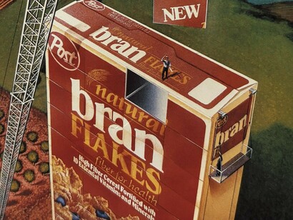
In the late twentieth century, commercial poster art frequently depicted things that did not exist. The burger that dominated McDonald's advertising for decades was never a representation of a genuine product. It was excessively tall, symmetrical, and well illuminated. Audiences all across the world understood this quickly and were unbothered by it because the image never claimed to depict a burger. It was showing them how it felt to want one.
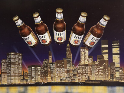
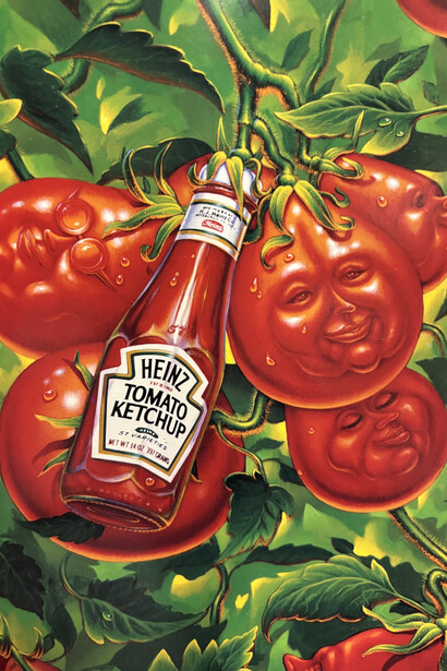
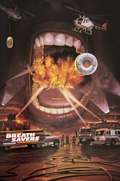
This was not an accident of taste or a product of particular enthusiasm. The visual language of this era was constructed with extraordinary deliberation, and its effects were understood by the people who made it. Colour was pushed beyond what nature produces. Objects were scaled beyond what rooms contain. Emotions were depicted at an intensity no single moment of ordinary consumption could justify. And yet none of this felt wrong, because the exaggeration was the point. These images bypassed reality entirely and made claims about desire instead, and desire, by its nature, is always larger than the thing that satisfies it.
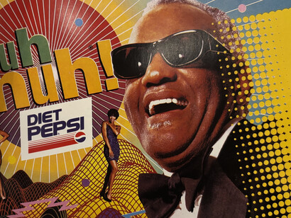
The colour choices of this era were among its most powerful and least discussed tools. Each major brand operated within a carefully constructed chromatic world, each colour chosen not for decoration but for the specific feeling it produced on contact. Coca-Cola's red was pushed to a saturation that exists nowhere in nature, warm enough to suggest intimacy and intense enough to register as excitement. McDonald's golds and ambers mimicked the colour of heat and late afternoon sunlight, creating an unconscious association between the image and physical warmth. Pepsi's electric blues evoked coolness, speed, and technological modernity. These were not decorative choices. They were emotional instructions delivered directly to the nervous system.
The airbrush, the defining technical tool of this era, made all of this possible at a precision that neither painting nor photography could achieve alone. It produced a quality of surface and light that was entirely artificial and entirely seductive: hyper-smooth gradients, impossible luminosity, and a perfection of skin and object that seemed to exist just beyond the threshold of the real. A Pepsi can created using an airbrush did not look like a photograph of a can. It looked like the best version of itself, perfected beyond anything a camera could honestly capture. The airbrush served a single purpose: to make things appear better than they were. As an artistic viewpoint, it is both extremely cynical and very honest, and the tension between the two readings is part of what makes this visual period so intriguing.
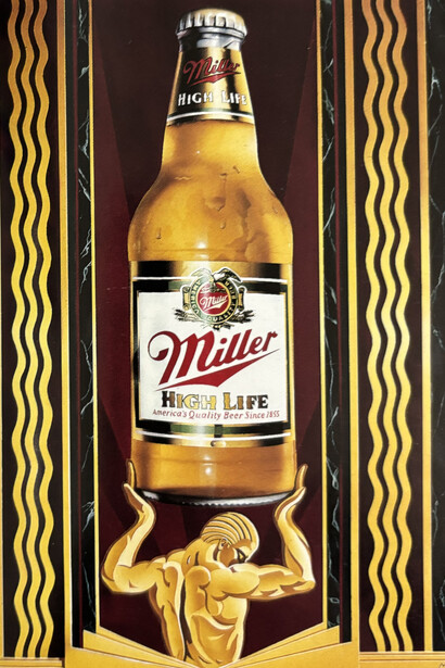
Composition did the same work as colour and technique but more quietly. Products were positioned low in the frame, larger than life, so that the viewer naturally looked up at them. It is a choice with a long history in portraiture and architectural photography, one that confers importance on whatever it frames. Applied to a hamburger or a can of soda, it produced images where the most ordinary objects appeared considered, deliberate, and somehow significant. The negative space around them only reinforced this, keeping the eye focused and the object elevated.
Typography was another layer of the same argument. The letterforms of this era were expressive objects, bold, rounded, shadow-heavy, and often italicised to suggest forward momentum. They leaned into the image rather than sitting quietly beside it. In the older posters, even the letters were excited. In the newer ones, typography has been trained to disappear, as though the brand has become embarrassed by its own desire to communicate.
Colour, composition, technique, and typography were not separate decisions. They were a single coordinated argument directed at the body before it reached the mind, and it produced some of the most emotionally effective images the twentieth century made.
Contemporary commercial advertising has largely abandoned all of this. In its place sits careful hyperrealism, natural light, muted palettes, and the texture of actual surfaces. The burger now looks almost exactly like the burger you will receive. Documentation has replaced the coordinated emotional argument. The image no longer reaches toward you. It simply sits there, accurate and inert.
The old visual language was genuinely manipulative. It sold abundance to people who could not afford it, depicted bodies that did not exist, and made harmful products shimmer with a beauty that had nothing to do with what they actually were. Audiences were right to notice the gap. And yet when the exaggeration was stripped away, what replaced it was a different and more subtle construction, one that performs neutrality while pursuing exactly the same ends. Today's carefully lit photograph of an imperfect sandwich is just as deliberately composed, just as precisely aimed at producing desire, as the airbrushed monument it replaced. It has simply learned to hide its intentions more completely, which is, in the end, the less admirable deception of the two.
The image always reflects its moment. This one arrived alongside a series of cultural ruptures, an era in which the distance between what was promised and what was delivered became impossible to ignore, and a broader exhaustion with the optimism that the old posters had always required of their audience. A society that no longer collectively believed in abundance stopped making images of abundance. The minimalist advertisement is not simply a design trend. It is a portrait of a particular historical mood, cautious, self-aware, and unwilling to commit to a vision of the future that might not arrive.
The old posters were dishonest about the product and transparent about the desire. Today's advertisements have simply reversed the order and called it progress.