 English
 Español
 Français
 Deutsch
 Italiano
 Português
We live in a world saturated with signs. From the moment we wake to a smartphone notification to the moment we fall asleep under the blue light of a television, we are immersed in a continuous flow of symbols, images, signals, and systems of meaning. Semiotics, the science of signs, offers the most rigorous conceptual framework available for understanding this semiotic environment: how meaning is made, how it is communicated, how it is contested, and how it shapes human experience at every scale, from the microstructure of a typeface to the macromorphology of a city.
The discipline of semiotics emerged simultaneously from two intellectual traditions in the late 19th and early 20th centuries: Ferdinand de Saussure's structural linguistics in Europe, which developed the concept of the sign as a dyadic relation between signifier (sound-image) and signified (concept); and Charles Sanders Peirce's pragmatic philosophy in America, which produced the triadic model of sign, object, and interpretant. These two traditions, structuralist and pragmatic, have generated two distinct but complementary approaches to semiotic analysis that together provide a comprehensive toolkit for reading visual culture.
The global visual communication design market, encompassing branding, advertising, user interface design, environmental graphics, and related disciplines, exceeded USD 5.7 trillion in value in 2023 when measured by advertising expenditure alone (Statista, 2023). Every dollar of this investment rests on semiotic assumptions about how visual signs create associations, trigger emotions, and motivate behaviour. Understanding semiotics is, therefore, not merely an academic exercise but a practical necessity for anyone engaged in visual communication.
Saussure's Dyadic model and its implications
Ferdinand de Saussure's Cours de linguistique générale (published posthumously in 1916 from student notes) introduced several concepts that became foundational for 20th-century semiotics. The most fundamental is the concept of the sign as an arbitrary union of the signifier (the sound-image or, in visual semiotics, the visual form) and the signified (the concept or mental content). The relationship between signifier and signified is, Saussure argued, arbitrary; there is no natural or necessary connection between the word 'tree' and the concept of a tree; the connection is established purely by social convention within a linguistic community.
This insight, apparently simple but actually radical, has profound implications for visual design. If all signs are arbitrary, then all systems of meaning are conventional, historical, and contingent. There is no natural connection between the colour red and danger (in many Eastern cultures, red signifies good fortune); no natural connection between a serif typeface and trustworthiness (a convention established by print culture that digital interfaces have partially disrupted); and no natural connection between a clean, white-space-dominated layout and luxury (a convention of specific socioeconomic contexts). Saussure's arbitrariness principle reveals that what designers do is, at the most fundamental level, the construction and manipulation of conventions.
Saussure also introduced the distinction between langue (the abstract system of language, the set of conventions shared by a linguistic community) and parole (the specific acts of speech or writing that realise the system in practice). This distinction maps onto design in revealing ways: a brand's visual identity system (its colour palette, typography system, logo, and grid) constitutes its design language, the abstract system of conventions; each individual design application (an advertisement, a product package, a website page) is a design parole, a specific realisation of that system.
Roland Barthes and the mythology of visual culture
Roland Barthes extended Saussure's framework into the domain of mass visual culture in his 1957 collection Mythologies, which remains among the most read and cited works of cultural semiotics. Barthes' central insight was the concept of myth, not in the folk sense of a traditional narrative, but in a technical semiotic sense: a second-order system of signs that naturalises ideology.
For Barthes, myth operates by taking a sign (itself already a union of signifier and signified) and using it as the signifier of a new, second-order sign, whose signified is an ideological concept presented as natural or inevitable. His famous analysis of a magazine cover showing a young Black French soldier saluting the tricolour demonstrates the mechanism: the first-order sign 'this Black soldier is saluting the French flag' becomes the signifier of a second-order sign whose signified is 'France is a great empire, and all her sons faithfully serve her, regardless of colour', a political claim about colonialism and national identity naturalised as a simple factual image.
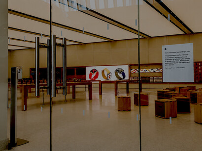
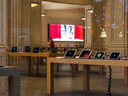
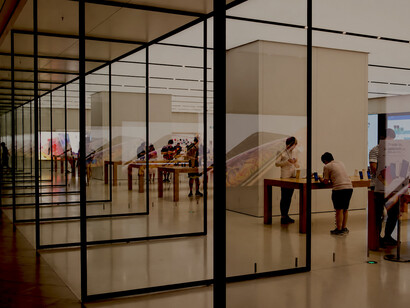
This barthesian analysis is directly applicable to corporate visual culture. When Apple's marketing system uses minimalist, white, clean aesthetics, it deploys a visual language whose first-order signifiers (whiteness, simplicity, emptiness) are the signifiers of a second-order myth: 'Apple products transcend clutter; they are pure, innovative, and superior to messy competitors.' The colour white is not inherently associated with innovation, but through sustained semiotic work across four decades, Apple has made this association feel natural, even inevitable. This is the work of myth: the naturalisation of the constructed.
A 2020 study by Logoworks found that 93% of consumers cite visual appearance as the primary factor in initial brand evaluation, demonstrating the degree to which semiotic work in branding precedes rational evaluation of product merit (Logoworks, 2020). Brands like Coca-Cola, whose red-and-white logo has remained essentially unchanged since 1886, demonstrate that semiotic consistency, the maintenance of a stable sign over time, creates value through accumulated cultural sedimentation.
Urban semiotics: the city as text
The city is perhaps the most complex semiotic environment that human beings have constructed. Roland Barthes himself wrote of the city as a discourse: 'The city speaks to its inhabitants; we speak our city, the city where we are, simply by living in it, by wandering through it, by looking at it. 'The discipline of urban semiotics, developed through the work of scholars including Umberto Eco, Henri Lefebvre, and Kevin Lynch, treats the built environment as a system of signs that communicates social relations, power structures, historical memory, and collective identity.
Kevin Lynch's landmark study The Image of the City (1960) introduced a semiotic framework for understanding urban legibility, the ease with which residents and visitors can navigate and mentally map a city. Lynch identified five elements of urban form that function as primary semiotic units: paths (the channels of movement), edges (the boundaries that separate districts), districts (areas with recognisable character), nodes (strategic focal points), and landmarks (prominent visual reference points). These elements constitute a spatial sign system that communicates spatial organisation and social meaning simultaneously.
Lynch found that Boston's clarity of legibility was impeded by the lack of distinctive districts and landmarks, a semiotic deficiency that translated into navigational confusion and reduced sense of place. Cities with high semiotic clarity, such as Venice with its canals and bridges as distinctive paths and nodes; New York with its numbered grid and iconic skyline landmarks; and Paris with its arrondissement structure and monumental axes, are experienced as more comprehensible and emotionally resonant environments. Subsequent research has confirmed that urban legibility correlates with resident wellbeing: a 2018 meta-analysis of 64 urban design studies found that perceived neighbourhood clarity and distinctiveness were significant predictors of place attachment and mental health outcomes (Mouratidis, 2018).
Wayfinding design: applied semiotics in space
Wayfinding, the design of systems that help people navigate complex environments, is one of the most directly applied domains of urban semiotics. Every hospital, airport, university campus, transit system, and urban district requires a wayfinding system: a designed set of signs, symbols, maps, and spatial cues that communicate location, direction, and identity. The design of these systems is a rigorous exercise in applied semiotics: selecting and combining signs that are universally comprehensible (iconic signs: a figure in a wheelchair signifies accessibility), culturally coded (symbolic signs: the colour of a metro line), and spatially indexed (indexic signs: an arrow pointing in the direction of an exit).
The London Underground's iconic map, designed by Harry Beck in 1933, is a seminal example of applied urban semiotics. Beck's map is not a geographically accurate representation of London's topology; it is a schematic diagram that sacrifices spatial verisimilitude for semiotic clarity. By straightening curves, regularising angles (to horizontal, vertical, or 45°), and equalising station spacing regardless of actual distances, Beck created a sign system whose primary function is cognitive navigation rather than geographic description. The map's enduring success – it has been continuously in use for over 90 years and inspired transit maps worldwide – demonstrates that semiotic utility (ease of sign interpretation) can supersede geographic accuracy as a design criterion.
Semiotics of colour in global contexts
Colour is among the most powerful and most culturally variable elements of visual semiotics. The meanings of colours are not universal; they are systems of convention that vary significantly across cultural contexts, historical periods, and specific semiotic domains. This variability presents significant challenges for global brand design, where a colour choice with positive connotations in one market may carry negative or contradictory meanings in another.
White, in the Saussurean sense, is a particularly revealing case. In Western design traditions, white conventionally signifies purity, cleanliness, and minimal elegance, which is why luxury brands from Apple to Chanel to Miele use white as a primary identity colour. In many South Asian and East Asian contexts, however, white is the colour of mourning and funerary ritual: brides wear red or other festive colours, and white garments are associated with death and bereavement. McDonald's initial launch of white packaging in China encountered consumer resistance attributed in part to these semiotic associations, a finding that contributed to the company's shift toward red and yellow in Chinese market materials.
The colour red illustrates the opposite dynamic: it is universally high in arousal value (psychophysiological research shows that red environments elevate heart rate and cortisol levels) but culturally variable in its connotations: danger in Western traffic systems, good fortune in Chinese and Indian festive contexts, revolutionary politics in leftist traditions, and passion in romantic contexts. The semiotic work of a red logo (Coca-Cola, YouTube, Pinterest, and Netflix) draws on and reinforces the arousal-energy axis while relying on brand context to determine specific connotation.
Digital semiotics: the emoji, the algorithm, and the feed
The digital environment has generated new semiotic systems of extraordinary complexity and speed of change. The emoji, a set of standardised pictographic symbols that emerged from Japanese mobile communication culture in the late 1990s and became globally standardised through Unicode, represents a new iconic sign system with fascinating semiotic properties. The thumbs-up emoji is primarily indexic (pointing to approval), partially iconic (resembling a gesture), and increasingly conventional in its digital-specific meanings (a passive-aggressive dismissal in certain social contexts, a semantic drift that illustrates Saussure's principle of the arbitrariness of the sign playing out in real time).
The algorithmic feed, the curated stream of content served by social media platforms, is itself a semiotic system that produces meaning through selection and juxtaposition. Instagram's visual aesthetic conventions (specific colour palettes, compositional templates, and lighting styles) are not merely aesthetic preferences but semiotic codes that signal authenticity, aspiration, or belonging within specific subcultural communities. The rise of 'dark academia', 'cottagecore', and 'clean girl' aesthetics on TikTok and Instagram represents the rapid generation and proliferation of subcultural visual semiotics, new systems of signs that organise visual self-presentation around specific identity-value clusters.
Conclusion
Semiotics, the study of signs, is not a peripheral academic discipline but a central science of human culture. Every designed environment, from the corporate logo to the urban district, from the website interface to the algorithm-curated feed, is a semiotic system: a structured set of signs that communicate meaning, construct identity, reproduce ideology, and organise experience. The question is never whether an environment is semiotic – all environments are, by virtue of human perception and interpretation – but how consciously and critically we engage with the sign systems that surround us.
For designers, semiotics offers both a descriptive tool (for understanding how existing sign systems work) and a generative framework (for designing new sign systems with precision and intentionality). For critics and citizens, semiotic literacy offers the capacity to denaturalise, to see the constructed character of what appears natural, to recognise the ideological work performed by images, and to resist the mythologies that visual culture routinely generates. In a world increasingly saturated with designed sign systems, this literacy is not a luxury; it is a civil necessity.
References
Saussure, F. de. (1916). Cours de linguistique générale [Course in general linguistics]. Payot.
Barthes, R. (1957). Mythologies. Éditions du Seuil.
Peirce, C. S. (1931–1935). Collected papers of Charles Sanders Peirce. Harvard University Press.
Lynch, K. (1960). The image of the city. MIT Press.
Eco, U. (1976). A theory of semiotics. Indiana University Press.
Statista. (2023). Global advertising spending 2023. Statista Research Department.
Mouratidis, K. (2018). Built environment and social well-being: How does urban form affect social life and personal relationships? Cities, 74, 7–20.
Logoworks. (2020). How colours affect purchasing decisions: The psychology of branding. Logoworks Consumer Research Report.