English
 Español
 Français
 Deutsch
 Italiano
 Português
Ellsworth Kelly (b.1923-d.2015) worked with a visual language that tested the limits and lines between painting, sculpture, and architecture. His time in France was influential to him, as encountering artists' works like Henri Matisse had a prominent effect on him. Kelly worked with proportion, and spatial perception rather than gesture and illusionism. He created works that look deliberately restrained, which intensified their impact. His multi-panel paintings and large sculptures have physical dominance that invite viewers to see space as an experience and structured around them.
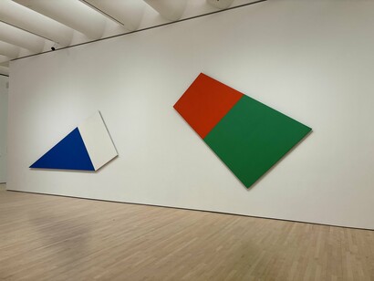
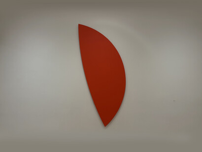
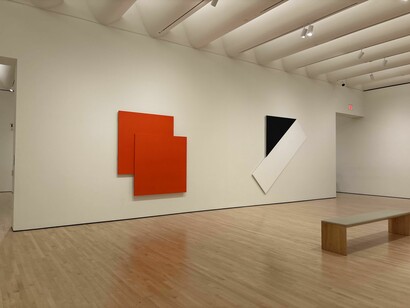
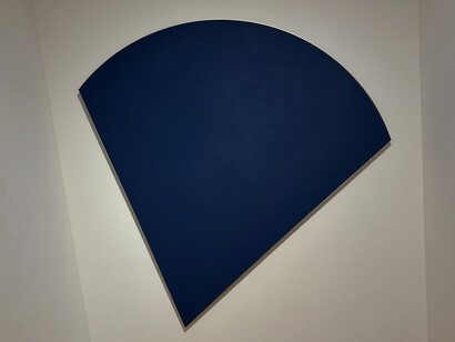
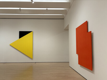
Kelly's language is formed with geometric forms, sharp edges, and bright monochrome color pallets. These aspects seem purposely limited, but their restriction actually highlights their impact. When approached from a structural scale, a single curve or rectangular plane acquires physical space. The absence of internal detail especially in an artwork, directs attention to proportion and relation with the surrounding environment. A panel’s boundary becomes a place for tension where something foreign meets a wall and where an object meets architecture. Kelly disrupts the neutrality of the wall by abandoning the typical or “expected” rectangular canvas in many of his curved pieces. Yellow Relief with Black (1993) uses connected canvases to build a framework that reorganizes the surrounding surface, altering the viewer's impression of a space and balances it without any kind of narrative or symbolism.
Large scale makes that shift in how we experience space feel immediate. Kelly’s panels approach the proportions of a column or a wall. The works force you to move around them. When you stand too close a panel's whole picture escapes you; if you step back, the surface's nuanced details fade. Kelly's work centers on painting people and objects. At the San Francisco Museum of Modern Art, his canvases can be observed at gallery scale but not in the sense of a small white cube but rather in multiple large white cubes. As an example, approximately 5 works occupy 1 gallery room in this museum. This is an amazing chance to view them because not only the occupied space is a very large gallery but also considering the scales of his other works, it’s very impressive that middle range-scaled works can occupy it without overwhelming it.
The curation of the room is very well thought out in the sense of when separately observing the works, they actually move the body towards a direction. On the other hand, when observing the whole space from a corner, initially, instinctive movement in one’s body can’t decide where to move. Information on direction is different from each other. So, when works are perceived together, it changes movement patterns through the space. The artwork does not simply occupy space; it controls and adjusts the behavioral patterns.
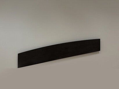
Material builds upon the spatial dimension of Kelly’s work. His career included work on oil on canvas, aluminum, steel, bronze, marble, and stone each chosen for its physical presence and ability to capture light. Kelly's investigation of architectural space continued with works such as Austin (2015). The building's curved walls and tinted glass panels convert natural light into radiant planes that move with the sun's position. Kelly sees material in these diverse media as an active participant in forming perception rather than as a simple tool of support.
Color operates similarly in his case. A bright, primary red plane pulls in and possibly overwhelms the viewer, while a pale blue one appears to stand back and creates more space. This establishes both psychological and physical depth without perspective. The flatness of the surface intensifies rather than diminishes this effect because depth arises through scale rather than layers or illusion. The clarity of Kelly’s chromatic decisions strengthens awareness of how color can alter spatial reading. A large monochrome field may expand a wall, while a sharply bounded contour compresses it. Color moves and expands on architectural structure through these processes.
What distinguishes Kelly’s work is the composition of simple extremes. Monumental scale coexists with simplicity. The works neither overwhelm through too much detail nor retreat into simply being an object. Rather, they maintain a strict balance where each shape and color adds to spatial perception. Continuous emphasis over display is supported by this balance. The viewer's position inside the space, the distance between panels, and circulation around is all understandable.
When considered together, these strategies can suggest that Kelly's work is more concerned with creating perceptual environments. Architecture becomes an instrument of color and light while sculpture acts as an architectural element, and painting evolves into sculpture. Rather than combining disciplines, shared elemental principles create a bridge between disciplines. Space is organized around fundamental forms, clear materials, and precise scale measurement. He simplifies visual language to its core while changing spatial perception.
In the absence of conventional narrative, his paintings show how visual form may be defined as a structure that influences both movement and perception. Kelly combines understanding art not as a self-contained object, but as an element of the space that shapes the perception. In this approach, monumentality is characterized by proportion and scale. At the same time, minimalism enhances impact. Kelly's approach combines art with architecture as interdependent disciplines and both have key roles in shaping how people perceive space.