English
 Español
 Français
 Deutsch
 Italiano
 Português
Here we go again: the annual end-of-year COP fandango is upon us. This particular Conference of the Parties (signatories to the original Framework Convention on Climate Change back in 1992) happens to be in Brazil—generally deemed to be a more sympathetic host country than its two petrostate predecessors, Azerbaijan and the United Arab Emirates.
That may be true (although rates of deforestation in the Amazon are on the up again), but COP30 will be just as resounding a failure (as in making not a ha’p’orth of difference) as the 29 other COPs that have gone before it.
There are many reasons for this: geopolitical, financial, technological, and so on. But I want to look at one aspect that rarely gets mentioned: almost every single delegate at COP30 will be focused on dodgy data—on things like the targets set by governments through their revised Nationally Determined Contributions, or on average temperature increases projected through to the end of the century (1.5°C and all that jazz), or on endless attention-grabbing voluntary initiatives about this, that, or the other technology or nature-based ‘solutions.’
Distractions, diversions, manufactured rows, performative breast-beating, competitive outrage, maybe even some tears if we're lucky: we're in store for all that and a lot more from COP30. Meanwhile, the data that really matters (the only data that really matters) will remain neglected on the sidelines, overlooked partly through ignorance but mostly by design.
I have a real bee in my bonnet about this: the very least we should expect of this annual blah-fest is agreement on which scientific measures really matter, alongside an annual report card (or dashboard) telling us how well we're doing against those measures.
The world of climate indicators can get super-geeky—just one of the reasons why the vast majority of people still have no idea just how deep in the climate doo-doo we really are. So, at the risk of oversimplifying, here is my take on the ten indicators that really matter, working my way logically from inputs into the global economy onto the consequences of those inputs (otherwise known as outputs!) through to the actual biophysical impacts.
Inputs
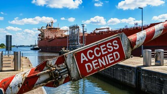
Capital flows
How much new investment ($trillions) is still going into fossil fuels?
It's also useful to measure new investments going into renewables (particularly solar and wind), and the International Energy Agency has just announced that renewable energy will overtake coal to become the world’s biggest source of electricity ‘by the end of 2026 at the latest.’ But we shouldn't get too excited about it: this won't actually matter as much as you might imagine until new investments in fossil fuels start coming down!
Subsidies
Yes, right up at No. 2—given that governments the world over keep pumping trillions of dollars into supporting fossil fuels, even as they seek to persuade their citizens how worried they are about the climate crisis. (There is, truly, an even toastier place in Hell for climate hypocrites than for out-and-out climate deniers).
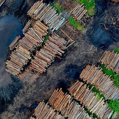
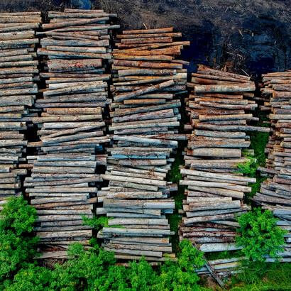
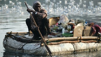
Rates of deforestation
This is the best proxy measure we have to represent all the ongoing and incalculable assaults on the natural world. And while some progress has been made in some countries, today's more intense and more frequent wildfires (caused largely by accelerating climate change!) are cancelling out all those gains that have been made.
Outputs
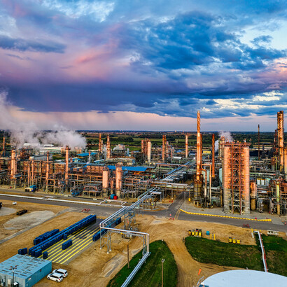
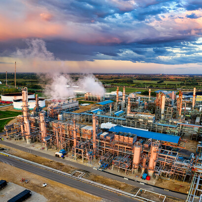
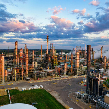
Emissions from the burning of coal, oil, and gas
Pretty critical, obviously. You may be thinking that there's been so much focus on fossil fuels that those emissions are bound to be coming down. Sadly, not so: in 2024, emissions from the consumption of coal, oil, and gas all hit new highs. Not even a plateau in sight, let alone a long-anticipated decline.
Emissions from plastics, cement, and steel
Ditto the above!
Emissions from the consumption of meat and dairy products
Let's be clear here: the annual COP fandango took 28 of its thirty annual appearances even to acknowledge that fossil fuels are the principal cause of the climate crisis. Consumption of meat and dairy products has warranted barely a mention during all that time. But it's a massive contributory factor—so let's at least get it on the dashboard!
Outcomes
This is where it gets interesting!
Total greenhouse gas emissions
We're very used to this one: how many billions of tonnes of combined greenhouse gas emissions (primarily CO₂ and methane) have ended up in the atmosphere compared to the year before? I'm duty-bound not to get too technical in this article, so all that matters is whether our dashboard shows things are still going up or starting to come down. Guess which it was in 2024?
Concentrations of CO₂ in the atmosphere
Ditto the above!
The global carbon budget
The carbon budget is an estimate of the amount of greenhouse gases we can ‘afford’ to emit, on an annual basis, and still have a reasonable chance of maintaining a stable climate. Our dashboard would reveal whether we're staying within our annual budget—or exceeding it. This is a beautifully simple measure, which is probably why politicians hate it!
The Earth's Energy Imbalance (EEI)
This is the big one—both physically and politically! It tells us the difference between the energy the Earth receives from the sun and the energy it radiates back into space. Over the long term, they need to be in balance; in the short term, unfortunately, the difference between them is getting bigger every year, with that imbalance doubling over the last two decades.
Everything else can basically be set aside. Politicians’ promises: mostly worthless. Corporations strutting their climate credentials: mostly despicable. Endless deliberations about the computer models used by the Intergovernmental Panel on Climate Change: just so much displacement activity for world-weary scientists.
But just imagine if the COP Climate Dashboard was released a couple of months before the start of each COP, depicting ‘progress’ over the last year with suitable RAG (Red, Amber, Green) graphics, allowing citizens to get their heads around the true extent of the staggering political failure still going on today.
And, yes, you guessed it: this year’s Dashboard would be one great big vermilion splash.