English
 Español
 Français
 Deutsch
 Italiano
 Português
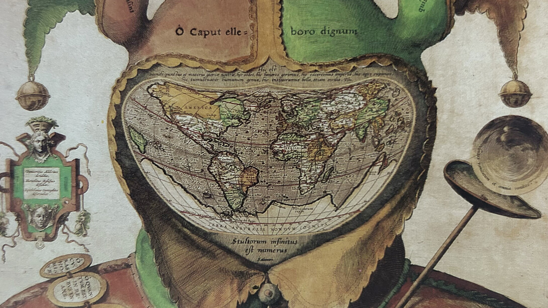
The science and art of creating maps, or cartography, has long been a window into how people perceive the world. Cartography has changed throughout time to represent both cultural narratives and empirical facts, from the clay tablets of ancient Babylonia to contemporary computerized maps. Early maps, such as the Babylonian World Map (circa 600 BCE), depicted the known world as a flat disk surrounded by a cosmic ocean, illustrating how ancient civilizations viewed their environment. Maps evolved into instruments that communicated power, identity, and ideology as exploration broadened our understanding of geography by including not just physical characteristics but also political, social, and symbolic factors.
Throughout our education, and in books, historical documentaries, and museums, we often encounter maps that range from impressively accurate to understandably flawed, given the limited knowledge available at the time they were created. These maps still resemble plans of terrain, land boundaries, houses, roads, and even seas, offering a fascinating glimpse into how people once understood the world. But in The Mapmaker’s Art: A History of Cartography by John Goss, the idea of what a map can be is expanded in unexpected ways. Among the chapters, the one titled “Curiosa,” meaning “curious,” features maps so imaginative and surreal that they challenge our very definition of cartography. As Goss notes, “the often fertile imaginations of mapmakers have on occasion come up with remarkable notions of imaginary lands, satire, distortions (accidental or intentional) of geographical truth, anthropomorphism, and so on,”1 all of which captivate modern collectors and viewers alike.
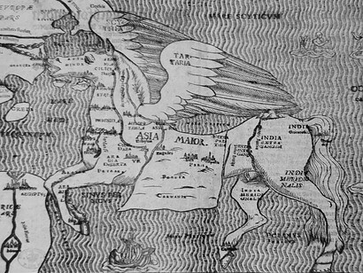
These cartographic curiosities are not just anomalies but windows into how earlier societies viewed their world, blending geography with mythology, religion, and social commentary. In medieval mappaemundi, for example, the map was not solely a tool of navigation, but rather it was "a medium for providing every kind of information, such as zoological, anthropological, moral, theological, and historical." Places like Paradise, Eden, and other lands appeared alongside real-world regions. Famous examples like the Hereford Map (c. 1276) and the Ebstorf Map (c. 1339) depict Africa teeming with all kinds of fauna, including unicorns and other fabulous beasts.
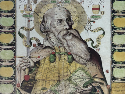
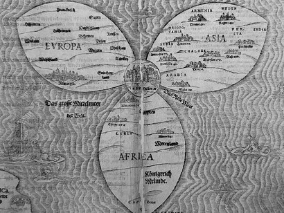
One particularly fascinating subgenre of these maps includes those shaped like humans or animals. A well-known anthropomorphic example is Heinrich Bünting’s Cloverleaf Map (1581), in which the world is depicted as a three-leaf clover centered on Jerusalem, representing Europe, Asia, and Africa. Each is shaped symbolically to reinforce a Christian worldview. Even more striking is Bünting’s map of Europe as a queen, Europa Regina (Queen Europe), first drawn in the 16th century. Here, the continent is illustrated as a crowned woman, with Spain forming her head, and other countries arranged to make up her body, arms, and flowing gown. This allegorical depiction was more than just decoration. During the Habsburg era, it was a political declaration that reflected the unity and divine right of Europe.
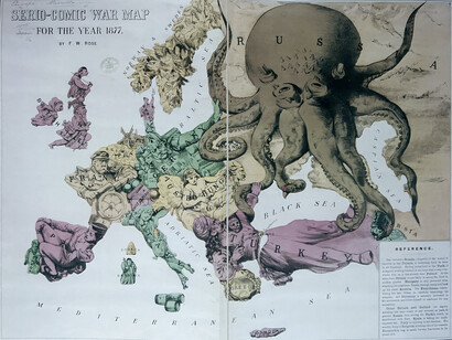
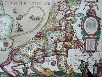
Zoomorphic maps, where entire regions or continents are depicted as animals, were also common, particularly in satirical or political contexts. For example, during the 19th century, European artists and commentators created caricature maps where countries were rendered as animals to mock or criticize political relations. The 1870 Octopus Map by Fred W. Rose is a notable example, showing Russia as a giant octopus with its tentacles reaching out menacingly to neighboring nations, which is a metaphor for imperial aggression. Another creative example is the Leo Belgicus, a map from the late 16th century that portrayed Belgium, Luxembourg, and the Netherlands as a lion, symbolizing strength and unity during the Dutch struggle for independence from Spanish rule.
These creative maps were made for a variety of purposes, including highly ideological ones, utilitarian ones, and symbolic ones. Maps were created to depict theological truths rather than geographic accuracy in religious situations, such as the medieval mappaemundi. For instance, Jerusalem was frequently positioned in the center of the globe to symbolize its spiritual importance. Images of spiritual lands or non-existent creatures were included because they fit the prevailing worldview of the period, which connected geography to morality, faith, and the divine order, rather than because they were thought to be geographically accurate.
Political and nationalistic maps, such as Leo Belgicus, were often created to promote unity, identity, or a particular regime's power. By visualizing Europe as a majestic queen or the Netherlands as a proud lion, cartographers communicated messages of sovereignty, pride, and divine favor. Similarly, satirical maps, particularly those from the 18th and 19th centuries, employed anthropomorphism and zoomorphism to express dissent, criticize empires, and raise awareness of conflict. These maps were more than just travel guides; they were propaganda, works of art, and persuasive devices.
In this approach, The Mapmaker’s Art not only documents the technical evolution of cartography but also explores its artistic, metaphorical, and often whimsical possibilities. It encourages us to see maps not merely as tools for navigation but as cultural artifacts—rich in meaning, mystery, and human ingenuity. Some maps were created not for accuracy but as artistic and political expressions: humorous, imaginative works meant to entertain, inspire, or convey an idea. Collectors of rare maps have long prized these artifacts not for their precision, but for their creativity, wit, and historical resonance. Cartography, after all, has never been purely a science; it has always, in part, been a canvas for the human imagination.
References
Goss, J. (1993). Curiosa. In The Mapmaker’s Art: A History of Cartography (p. 329). Essay, Studio Editions Ltd.