 English
 Español
 Français
 Deutsch
 Italiano
 Português
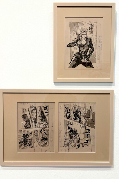
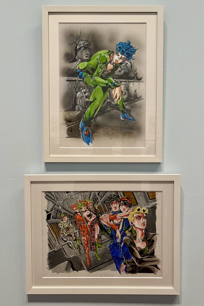
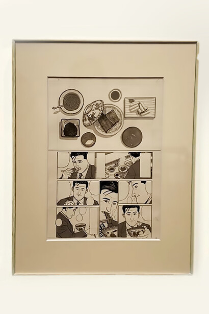
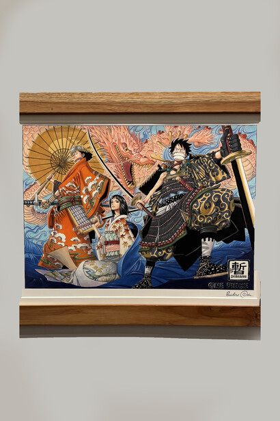
At the de Young Museum in San Francisco, the exhibition Art of Manga does something unusual for a fine arts institution. Among the 600 original drawings on display, Hirohiko Araki's JoJo's Bizarre Adventure occupies a dedicated space that immediately pulls visitors into a world where color, pose, fashion, and environment interact as a unified whole. In my experience, this area became a natural gathering point where visitors lingered to study details, compare panels, and take in the full scope of Araki's shifting palettes and expressive compositions.
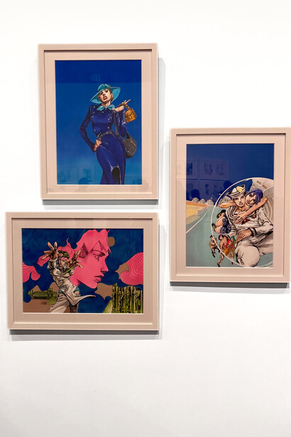
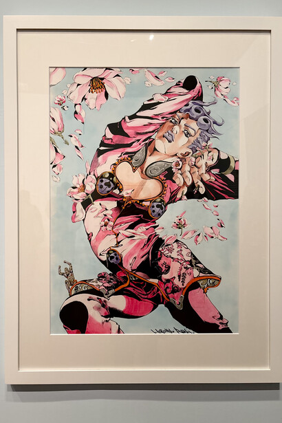
What the exhibition makes visible is something that reading the manga or watching the anime alone cannot convey. Each illustration functions as a self-contained composition. A character may appear in warm golds in one panel and cool violets in another, with posture, outfit, and surrounding architecture recalibrated to produce specific emotional effects. Standing within this arrangement, viewers experience firsthand how Araki's characters maintain recognizability not through hue but through structural consistency, while color and context remain free to express energy, atmosphere, and emotion.
Araki has been explicit about this. In a 2017 interview, he explained that he changes colors deliberately to give readers different feelings through different combinations. This is not an inconsistency or production variation. It is a rejection of the idea that color should remain stable. In JoJo's Bizarre Adventure, there is no single authoritative palette. Even details that appear fixed are subject to change if the composition demands. Aesthetic judgment overrides continuity.
Where most character design uses color semiotically, as a fixed attribute that guarantees recognition, Araki uses it relationally. Hue, saturation, value, and temperature are determined within the internal logic of each image rather than across a stable model. Complementary contrasts heighten tension, analogous palettes unify mood, and shifts in value or temperature recalibrate the emotional tone of a scene. The same figure might appear in warm golds to suggest intensity and then in cool violets to produce distance or unease, without either version claiming greater authenticity. Color functions less like a label and more like a variable that responds to context.
This extends to every visual element. The angles and exaggerations of a character's pose, their fashion, and the perspective of the surrounding environment all work together to shape the mood and energy of a particular piece. These elements shift from one artwork to another, calibrated to narrative tone. Posture reinforces personality, while surrounding architecture, furniture, or landscape bends to support the overall feeling of the composition. Recognition is preserved not because the palette or setting remains consistent, but because it no longer carries that responsibility. Identity is anchored instead in form, silhouette, and attitude, allowing color, pose, and environment to operate flexibly and meaningfully. Araki's approach aligns more closely with painterly traditions, where chromatic and compositional decisions are tied to the needs of a single image, than with contemporary character design, which prioritizes consistency across reproduction.
Even official attempts to standardize color fail to resolve this instability. Digitally colored editions of the manga provide one possible version, but they do not override the underlying logic of variation. The question of a correct palette remains open because it is not a question the work is designed to answer. The anime adaptation offers a useful contrast here. Animation requires a degree of consistency for practical reasons, as characters must remain visually stable across extended sequences. Yet even here, Araki's influence is visible. Sudden scene-wide palette shifts transform entire environments to heighten emotion or emphasize surrealism, preserving the idea that color is expressive rather than fixed, even within a medium that depends on repetition.
The exhibition design at Art of Manga makes this philosophy tangible. Araki's works were placed in a central position along the route, with gallery wall colors that subtly enhanced the shifting palettes in each illustration. Most striking was a massive multi-panel work displayed on a standalone wall, surrounding visitors in an uneven U-shape and placing characters at near life-size scale. The spatial arrangement turned the gallery into a physical counterpart of the work itself, an immersive environment where color, pose, fashion, and perspective interact as a total experience, rather than a collection of fixed images.
What the exhibition ultimately reveals is the full implication of Araki's system. In most franchises, color is tightly controlled and centrally defined. In JoJo's Bizarre Adventure, it remains deliberately unstable, and that instability is the work's most radical quality. Araki's characters are among the only major figures in contemporary visual media whose identities are proven precisely by their ability to survive without fixed color. They remain recognizable across constant variation, which positions them closer to literary characters than to conventional visual icons. Like figures in a novel, they are not bound to a single visual form. Each image becomes an interpretation rather than a repetition. The disorientation of seeing them in unfamiliar colors or environments is not a break in continuity. It is the point.