English
 Español
 Français
 Deutsch
 Italiano
 Português
Having established the broader theoretical framework, this section turns to the medium itself. The transition from still images to moving images introduces a new set of challenges and possibilities. Motion not only reshapes how meaning is constructed but also alters the way audiences perceive, interpret, and emotionally engage with visual narratives.
When adapting from still images to moving images, certain transformations are inevitable due to the distinct demands of each medium. Nevertheless, Immortel largely preserves the visual essence of Bilal’s original work. The film’s aesthetic choices, such as its color palette and cinematography, reflect the graphic novel’s distinctive look, creating a cohesive visual narrative infused with striking, surreal imagery that merges cyberpunk aesthetics with mythological iconography.
Certain changes arise inherently from the shift in medium. The experience of the audience in reading a graphic novel versus watching a film is, as expected, distinct, with these differences stemming from the inherent characteristics of each medium. For example, in Understanding Comics, Scott McCloud draws attention to the unique strengths of the graphic novel, claiming that readers have control over the pacing at a rhythm of their choosing, allowing ample time to reflect on intricate visual details in a way that is not possible in film, where pacing is determined by the medium.
Moreover, Bilal’s decision to structure the graphic novel across three volumes, using techniques such as time jumps, flashbacks, and parallel narratives, creates a disorienting yet immersive quality in the story. McCloud further discusses this concept of “non-linear time” in comics, where the spatial arrangement of panels facilitates the simultaneous exploration of past, present, and future, adding depth to the narrative.[1] Thanks to the mental process of filling the gutters between these sequential panels, Bilal can interweave multiple storylines and thematic layers without losing coherence, giving readers the freedom to interpret connections across pages or volumes.
Unlike The Nikopol Trilogy, the film has a more linear and direct storyline. The film’s pacing is dictated by the medium, with less room for the intricate shifts and subtle narrative pauses that a graphic novel affords. As exemplified in the previous sections, the compression of story elements means that some subplots or secondary characters receive less development compared to graphic novels.
A defining feature of Immortel is Bilal’s use of a hybrid approach, combining live-action with CGI, blurring the boundaries between graphic novel and cinema, thus crafting a hybrid world—mirroring the film's societal blend of humans and aliens—which offers an uncommon visual experience within mainstream cinema. At the time, Bilal’s method was pioneering; subsequent comic book adaptations, such as Sin City (2005, Frank Miller) and 300 (2006, Zack Snyder), adopted similar CGI and live-action integration.
However, the use of CGI in Immortel created a slightly cold and artificial aesthetic that lacks the depth and texture of Bilal’s hand-drawn art. Furthermore, sound introduces a distinctive dimension between film and graphic novels, as film utilizes audiovisual storytelling, while graphic novels rely on text-based cues to suggest sound within panels.
In film, sound is essential to narrative depth, providing cues that clarify the plot and amplifying the emotional impact of scenes. Sound contributes layers of mood, tension, and atmosphere that engage the audience on multiple sensory levels. For instance, in Immortel sounds such as city noise, the roar of flying car engines, and the electronic hum of holograms not only signal the cyberpunk genre but also enhance the authenticity and immersive quality of the film’s world.
The style of Enki Bilal
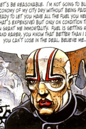
It is a crystal clear fact that the application of color is a well-established component that significantly enhances narrative depth. As a fundamental element in visual arts, color is crucial in conveying mood and illuminating character psychology. As a dystopian science fiction graphic novelist, Bilal frequently employs a palette dominated by cold, desaturated, chipped colors—primarily blues, grays, and earthy tones—to evoke a sense of dystopia.
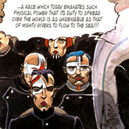
Although he occasionally incorporates vibrant colors like red and yellow to create contrast and draw attention to specific characters or moments, his overall color scheme reinforces the bleak, oppressive atmosphere characteristic of his narratives. For example, Nikopol is depicted falling among the impoverished residents of Paris. While the rest of the characters are shown in muted colors, the yellow spark symbolically represents the presence of Horus, who is seen lifting Nikopol into the air in the next panels, drawing him closer with an otherworldly force. The godly interaction is depicted with the bright, sparkling color yellow. This moment is important for Nikopol, as his life will not be the same as it was before.
Bilal’s drawings exhibit an edgy, rough aesthetic characterized by heavy, expressive line work. He incorporates intricate details that contribute to a degraded, gritty visual atmosphere, of the essence of cyberpunk’s dystopian imagery. Bilal employs a mixed media approach skillfully blending watercolor with colored pencils or chalk.[2] This technique enhances the textural depth and tonal richness of his work, contributing to the layered, atmospheric quality of his visual style.
The interplay of light and shadow holds equal significance to Bilal’s use of color, functioning as a vital tool for narrative and atmospheric effect. By employing strong contrasts, Bilal isolates characters and emphasizes specific moments, creating a chiaroscuro effect that fills scenes with heightened drama. Strategic illumination of certain characters or settings serves to make futuristic elements stand out, signaling importance.
This approach creates a sharp contrast with the predominantly dark backgrounds, causing an eerie visual effect that heightens themes of technological dominance and alienation. The absence of sunlight in his panels evokes a world drained of life and vitality, enhancing the sense of urban decay and contributing to the oppressive, dystopian mood.
An example of the strategic use of lighting in conveying divinity is seen in two contrasting images. In one, light is used to emphasize Théodule I’s public appearance, highlighting his position and the authority of the church as he delivers a speech. The light descends from above, evident in the shadows cast by the cherubic figures, gently illuminating the heads of the onlookers.
This signifies that the divinity within the enlightened figure emanates from above, dwelling more powerfully within him than in the others. This intensity of light underscores his unique inner radiance, while only a faint trace of it reaches the other figures, barely touching the tops of their heads. Additionally, the composition exhibits a nuanced gradient in light: the foreground remains relatively dark, the middle ground lighter, and the background brightest. This backlighting serves to further emphasize Théodule, who is dressed in blue; the light falling on his shoulder distinctly separates him from the background, enhancing the perception of depth and highlighting his significance within the scene.
Meanwhile, a radiant light follows Horus’s claws as he transforms from his falcon-headed human form to that of a winged falcon. The primary light source is the ethereal, fog-like white material, illuminating Nikopol's face through a technique known as side lighting but with a softened quality. This approach gently highlights his features, creating a subtle yet impactful contrast that enhances the overall atmosphere. This illumination symbolizes his divine, supernatural power, visually emphasizing his otherworldly presence.
Moreover, Bilal’s approach to panel layout is heavily influenced by cinematic techniques, employing wide frames and unconventional angles to create a sense of scale and perspective that enhances the visual flow, giving each page the quality of a film sequence. By avoiding traditional panel grids in favor of fluid, asymmetrical arrangements, he introduces tension and movement, a style well-suited to his complex, fragmented narratives. This panel structure mirrors the disjointed, chaotic progression of his stories, reinforcing their thematic depth.
However, Immortel operates at a faster narrative pace compared to the graphic novel due to the need for plot progression and doesn’t allow for the same level of atmospheric build-up as the graphic novel. In terms of angles, the graphic novel employs unconventional perspectives and close-up shots that allow for deeper engagement with the characters’ psychological states.
Translating these intricate visual details to film is a complex creative task, as certain angles may lose their original impact in a dynamic, moving format where the focus is less controlled than in a static image. Yet, in adapting his graphic novel to film, Bilal retained his signature style, preserving the somber, claustrophobic color palette and bleak atmosphere. The film’s aesthetic closely mirrors that of the graphic novel, with dimly lit scenes that evoke a noir sensibility similar to Blade Runner, capturing a similarly dark, oppressive atmosphere.
In a graphic novel, what leads the narrative is text and dialogues, which are as integral to the narrative as the visuals themselves. Reading one of Bilal’s works offers an experience akin to reading a literary novel. Although he occasionally allows the images to convey meaning independently, Bilal often combines visuals with literary elements to deepen the narrative. He frequently incorporates narrative boxes that provide fragmented insights or additional context, which can create a disorienting effect, immersing the reader in the characters' often confused or fragmented mental states.
Visual comparative analysis
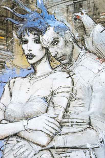
Beginning with a comparison of color in characters’ portrayal across both mediums, notable differences emerge between the representation of human and nonhuman characters. Bilal depicts human characters with more natural skin tones and organic textures, emphasizing a fragile, flawed appearance that symbolizes human vulnerability. This is exemplified by Nikopol, the primary human figure in the story, who loses a leg during his fall, emphasizing the inherent fragility of the human body.
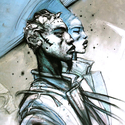
To the contrary, Bilal illustrates his posthuman characters with colder, monochromatic colors, primarily in shades of blue, gray, pale green, or metallic tones, evoking a synthetic or robotic quality. Despite their smoother, shinier skin textures, these color choices create an impression of artificiality, reminiscent of cyborg aesthetics. For instance, Jill, an extraterrestrial being, is depicted in blue, reinforcing her extraterrestrial nature. Thus, this color scheme aligns with the cyberpunk sci-fi genre's conventions for representing post/transhuman elements, effectively differentiating the human from the synthetic.
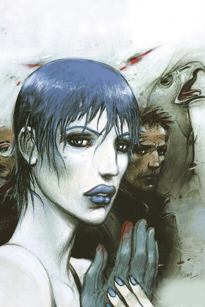
Moreover, Bilal’s human characters are depicted with rough, expressive line work that emphasizes their emotional depth. In the graphic novel, Bilal often illustrates these characters with stoic or resigned expressions, adding detailed, looser lines around their faces and eyes to convey a sense of weariness, as though the existential struggles of their world burden them. This approach gives them a “lived-in” look, with eyes framed by deep shadows that evoke a haunted quality.
The human body is rendered warmly, albeit with visible imperfections, which evokes sympathy and emphasizes their vulnerability. Even the nonhuman beings, typically depicted with an emotionally detached, cold demeanor, display greater expressiveness in the graphic novel than in the film adaptation.
In Immortel, due to the limitations of CGI technology at the time, the gods appear notably stiffer and less expressive in the film, reducing their emotional depth and ambiguity. While this approach sacrifices some of the complexity seen in the graphic novel, it enhances the perception of these characters as cold and inhuman.
Altered humans with partially completed modifications—metallic limbs, glowing implants, or biomechanical accessories—are represented as broken, dirty, and incomplete. Through this unaesthetic portrayal, Bilal critiques the fusion of technology and biology as a misguided attempt to transcend human limitations, underscoring the unsettling and dehumanizing aspects of posthuman transformation.
In addition to the contrasting depictions of human and nonhuman characters, the adaptation introduces subtle shifts in the portrayal of post/transhuman elements, reframing the narrative from a political critique to a corporatocratic technocracy. The inclusion of the new character Dr. Elma Turner—a scientist involved in alien specimen collection for a eugenics corporation—enhances the visual representation of posthuman themes. This character also contributes to a narrative shift, portraying a corporatocratic dystopia where the corporation exerts considerable control over both social and political spheres, thereby emphasizing the pervasive influence of corporate power in shaping societal norms and governance.
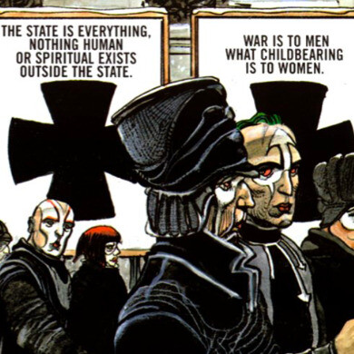
The composition of the government protest reveals further visual contrasts. Both versions utilize the "frame within a frame" technique; however, in the graphic novel, criticism of the government occurs in the streets among the people, actively engaged in protest with red hues underscoring the intensity of their actions. In contrast, the film presents this criticism on a television screen floating in the sky, depicted through an interview between a newsreader and a robot.
This shift in the mode of protest—from street demonstrations to robotic media representation—illustrates a transition from organic to artificial forms of dissent, reinforcing the thesis. In the film, the public critiques the government, while the televised segment focuses on criticizing Allgood, the eugenics company owner and gubernatorial candidate, highlighting his corporate interests and political motives.
The Nikopol Trilogy presents a layered narrative centered on political oppression in a dystopian posthuman future, while Immortel (ad vitam) offers a streamlined adaptation that shifts the emphasis toward corporatocracy and bio-politics. Despite these differences, both works articulate Bilal’s overarching dystopian vision through distinct narrative forms. Their portrayals of post and transhuman elements remain grounded in Bilal’s characteristic cyberpunk aesthetic of advanced technology coexisting with diminished living conditions.
The adaptation process inevitably introduces divergences, visible in character portrayals, visual styles, and structural choices. These variations highlight the possibilities and limits of translating graphic narratives into film. Ultimately, the comparison underscores how each medium amplifies different facets of Bilal’s artistic vision. Together, they provide a comprehensive exploration of power, technology, and humanity in Bilal’s imagined futures.
References
Bordwell, David, and Kristin Thompson. Film Art, 8th ed., Mc Graw-Hill, pp. 76–76.
“Enki Bilal.” Lines and Colors Art Blog, 13 Jan. 2006.
McCloud, Scott. “Chapter Four: Time Frames .” Understanding Comics, 1994, pp. 94–117.
Sampanikou, Evi D. “Chapter One Postmodernism, Posthumanism, and Transhumanism in Science Fiction: Graphic Novels. Enki Bilal and The Hatzfeld Tetralogy.” Audiovisual Posthumanism, Cambridge Scholars Publishing, 2017, pp. 192–201.
Sherryl Vint 3 types of posthumanism: Vint, Sherryl. “Part 2 Chapter 11: Posthumanism and Speculative Fiction.” Palgrave Handbook of Critical Posthumanism, vol. 1, pp. 226–226.