English
 Español
 Français
 Deutsch
 Italiano
 Português
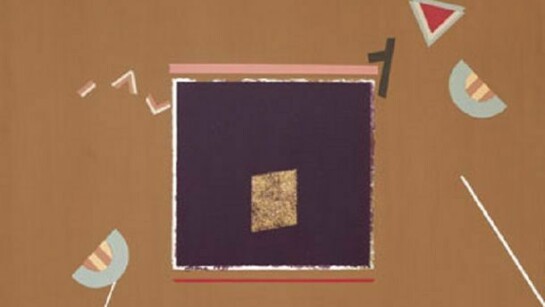
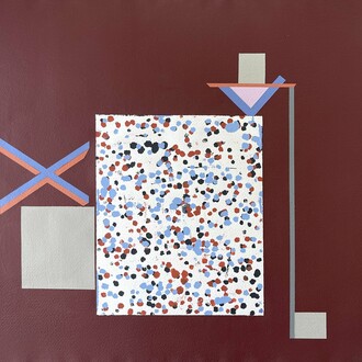
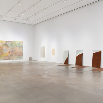
We are delighted to announce SEFA’s first solo show of Carole Eisner’s paintings. While Eisner has had many paintings exhibitions, this is the first to feature the brief period from the late 70s to early 80s, during which time she painted some 30 geometric abstractions, 14 of which will be on view. A fullyillustrated catalogue is available.
Carole Eisner defies categorization as an artist. Equally comfortable working with scrap metal for sculpture and acrylic paint on canvas, Eisner has moved seamlessly between the worlds of steel and paint throughout her long and esteemed career. Those who know her well have said that if you see an Eisner sculpture next to an Eisner painting, you know they are by the same artist. After receiving a BFA in Fine Art from Syracuse University (1958), Eisner returned to New York City where she worked for several fashion designers. She garnered industry awards, including Mademoiselle magazine’s Best Young Designer from their 10 Women of Merit story in 1961 (Joan Baez won for folk singer that year). After her first of five children was born, Eisner left the design world and began to paint at home. “I didn’t have a studio in our first apartment, so I threw tarps on the sofas and just started to paint,” she says. Eisner always favored abstraction, building compositions with collage and splashes of color and telling stories in shapes and form.
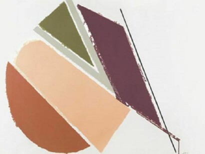
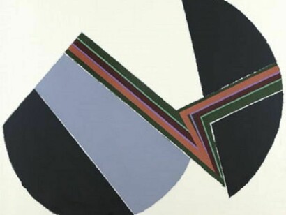
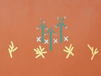
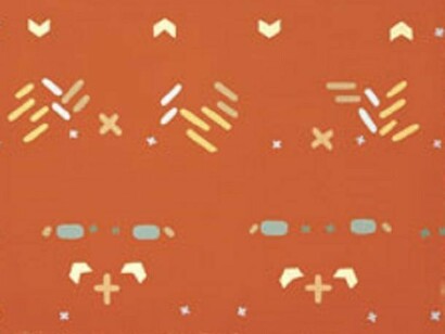
While Pop art was in full force, Eisner always related more to the Abstract Expressionists. “I recall very vividly going to MoMA during high school to see Pollock’s paintings,” she says. “It was an epiphany for me to understand that you could paint outside of the lines.” Along with Pollock, she was also influenced by the work of Josef Albers and Marc Rothko, who showed her the power of the rectangle and how colors could vibrate and shimmer when next to each other. I soon started to paint my own geometric abstractions with my personal color palette of orange, yellow, rust and turquoise,” says Eisner, who would eventually call these paintings her Dancing Hieroglyphics.
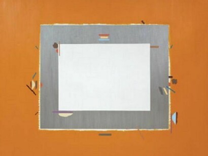
Eisner needed more than the rectangle inside the rectangle, and by the late 70s her hieroglyphics began to appear on the edges and inside and outside of the larger geometric shapes. Squiggles, dashes, Xs, triangles, lines and semi-circles would dance across the canvas, like punctuation marks in contrasting colors, or staccato notes on a musical score. Eisner played with the thickness of borders around the rectangles and squares, sometimes using the razor edge of the tape to create a sharp line, but increasingly allowing the line to blur and the color to bleed, creating fuzzy edges. “It felt right to let the color leak out a bit, more like how the world really is,” adds Eisner.
Commercially available in the 1950s and widely used by artists by the 1970s, acrylic paint became an important tool for Eisner. “People said acrylic was not as rich and glossy as oil paint, but it had a flatness that was ideal for the graphic, smooth quality I was after,” says Eisner.
By the end of this period, Eisner’s signature shapes grew and obliterated the confines of the larger quadrangles. All grown up and independent, the shapes now took center stage, and a new series of geometric paintings was born, exemplified by “Yond” on this catalogue’s cover. The brief era of the Dancing Hieroglyphics had ended, making the some 30 extant paintings from this series all the more precious.