English
 Español
 Français
 Deutsch
 Italiano
 Português
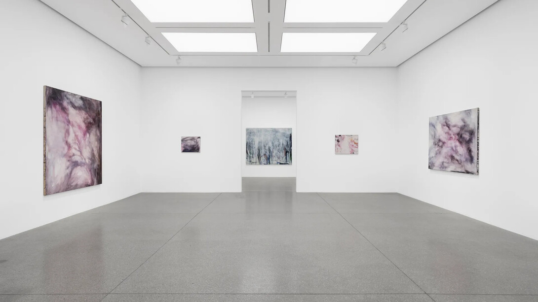
In my paintings, darkness could be white, blue, and indeed, pink, [...] where there is light there is naturally always darkness, whether I work in acrylics or oils, I always feel that I am always pursuing this alternation in my work.
(Yoko Matsumoto)
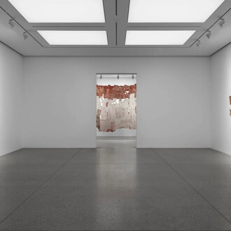
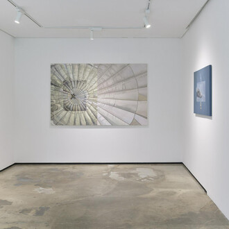
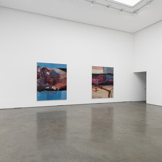
Surveying Yoko Matsumoto’s career-defining pursuit of luminosity, Gazed at by nature brings together paintings and works on paper from 1985 to the present day. Attesting to a lifelong negotiation between two worlds, Matsumoto initially worked with water-based acrylic paint for its likeness to East Asian sumi ink, before going on to master the medium of oil paint so integral to Western art history and tradition. For the artist, questions of colour, and the ability of painterly medium to transform the canvas surface, to impart lightness and depth, have been her central concerns. ‘In my paintings, darkness could be white, blue, and indeed, pink’, she has noted, ‘where there is light there is naturally always darkness, whether I work in acrylics or oils, I always feel that I am always pursuing this alternation in my work’.
The illuminating essay by art historian Reiko Tomii below provides the broader context of Matsumoto’s artistic inquiry: from the ‘negative legacy of modernism’ in Japan and her arts education in 1950s Tokyo, through to her formative encounters with Abstract Expressionism in New York in the late 1960s.
Looking at painting is not easy. As one of my painter friends once complained, many people simply cannot see painting – especially abstraction. I have to agree. In fact, I am among those guilty as charged. Take, for example, the painting of the Tokyo-based artist Yoko Matsumoto. Living in New York, I have only had a few chances to see her works in person. I must confess: initially I didn’t really look with the attention necessary to truly see the artist in them.
But when I encountered her works recently, I was intrigued. What struck me was how tremendously adept she is in both oil and acrylic and how successfully she expresses luminosity in each. Why does this matter? Because ‘light’ had long been considered the missing element in Japanese modernist painting executed in oil, in effect, the entire genre of yōga (Western-style painting). The centuries-old Western medium of oil painting was imported to Japan in the mid-19th century, as the country briskly began its Westernisation under the banner of modernisation. While the Impressionists made an indelible mark on global art history through their use of oil paint to express light, Japanese modernists struggled in mastering the medium. Matsumoto has transcended this local history through two key endeavours. First, by the mid-1970s, she created her ‘pinks’, which represent her effort to express light through the water-based medium of acrylic. In the early 2000s, she then shifted to the ‘greens’, and later to the ‘blues’ and the ‘whites’, pursuing the same goal through oil. Taken together, her works speak to her ambition and tenacity in overcoming the negative legacy of modernism in her homeland by creating something uniquely her own. With these series, she has negotiated one crucial tension in the formation of Japanese modernist painting.
Oil has long haunted modern Japanese painters. In Japan, and more broadly across East Asia, water was the primary binding medium of painting, with its historical dominance paralleling that of oil in the West since the Renaissance. Mixed with sumi (soot), water produces sumi ink. This centuries-old material has proven particularly conducive to the moist climate of the Far Eastern archipelago, making possible, for example, Broken ink landscape (Haboku sansui, 1495) by the 15th-century Zen monk Sesshū. In modern Japan, however, practitioners of yōga had to confront a completely different tradition imported from the West and struggled with the viscous medium of oil. As Japan, after being defeated in World War II, was reintegrated into the international community, critic-curator Atsuo Imaizumi visited Paris and Venice in 1951–52 to research European modernism and the presentation of Japanese contemporary painting. He was shocked at the mediocrity of the Japanese works compared to those of their European counterparts. Upon his return, he summarised the shortcomings of Japanese oil painting with two crushing adjectives: ‘muddy’ and ‘clumsy’.1 That is, Japanese canvases appeared ‘muddy’, with their executions amounting to no more than ‘clumsy’ attempts at modernity. In short, they had not mastered the lingua franca of international art.
In the case of Yoko Matsumoto, she studied oil painting at the country’s top art school, Tokyo University of the Arts, from 1956 to 1960. The education she received was conservative. She detested the gloomy classrooms of the oil painting department, filled with canvases of female nudes rendered in heavy brushstrokes.2 ‘Despite all the beautiful colours in the world, they all painted with such dirty shades!’, Matsumoto recalled. She aspired to go in the opposite direction: to paint buoyant abstractions in transparent colours, to express light through oil. Matsumoto experimented with different types of oils without success. Indeed, the pinks she managed to produce in oil were, in her words, ‘opaque, heavy, and disagreeable.’ All she wanted was to ‘create a painting with no constraint and move my hand freely to my heart’s content,’ but after graduating in 1960, she felt herself ‘chafing under the weight of the Western tradition that is oil.’
In June 1967, Matsumoto married the art critic Teruo Fujieda and later that summer, she accompanied him to the United States.3 By the end of the year, the newlywed couple settled in New York and Matsumoto explored modernist masterpieces in the city’s museums: Picasso’s Les demoiselles d’Avignon (1907) and Matisse’s Dance (1910) – works she had only previously known through reproductions – were revelations in person, as were the large canvases of Abstract Expressionists.4 These works compelled her to discard much of what she had learned in Japan. The one who most attracted her, however, was Helen Frankenthaler, who had invented the soak-stain method using turpentine-thinned oil paint.5 When Matsumoto found Frankenthaler’s gigantic Mountains and sea (1952) at the Metropolitan Museum of Art6 – a ‘beautiful picture that is so thinly painted’ – she visited the Met weekly to see it. Seeing these works in person, she began to re-educate herself on what painting could be.
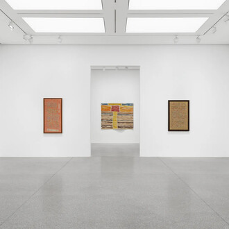
Another crucial discovery in New York was Liquitex, the commercially available acrylic paint.7 Although acrylic is water-miscible, unlike sumi ink it is not intended for drawing or staining. Matsumoto nonetheless decided to work with it for its affinity with water, which reminded her of sumi. She believed then, and still does, that sumi ink painting represents the quintessence of Japan’s painterly tradition. Above all, she was drawn to Liquitex because it offered a shade of pink that she particularly liked. Her aspiration was to create ‘coloured sumi painting’ that would be comparable in ambition to that of her American predecessors – such as Pollock, Newman and Rothko – yet realised through a water-based medium that would assert her Japanese sensibility for space. By 1974, her first signature pieces were born.
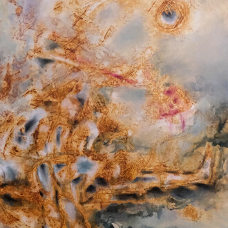
Her ‘pink paintings’ feature floating forms that remind me of flowing mists and drifting clouds. In some, pink dominates. In others, pink veils, contends with or otherwise intermingles with black, with the light contained within these pink forms shimmering against the darkness around them. To create such amorphous abstractions, Matsumoto takes full advantage of her water-based medium. That she works horizontally, with the stretched canvas laid on the floor, is signalled by the profuse drips visible on all four edges. These drips are bright and raw, unlike the rather subdued palette found on the picture’s surface. The painting reveals the artist’s labour and control, inventively expended by the daubing, wiping and layering of watery colour.8 In Matsumoto’s ‘pink paintings,’ light emerges from water.
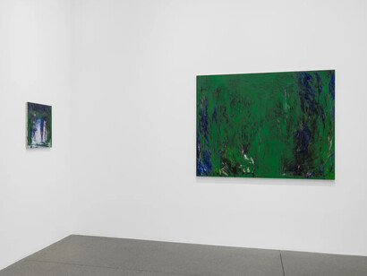
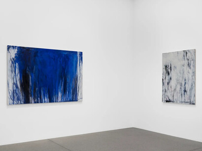
Matsumoto’s tireless pursuit of luminosity in pink continued until 2004, when she returned to the medium of oil and launched a new series – the ‘green paintings’. Having worked in pink exclusively for some 30 years, she was keenly aware that pink was a ‘minor colour’.9 In her opinion, the most important colours were ‘blue, brown and green, as typically seen in Cézanne’s works’, such as his Sainte-Victoire landscapes. ‘Pink and purple are not unimportant’, she said, ‘but [the] blue of the heavens and [the] green of the earth are primary shades.’ To create the green paintings, she worked with her canvas leaning against the wall or placed on a large easel. (Unlike the pink paintings, no drips appear along the edges of the green paintings.) Greens dominate, accentuated by black, with occasional touches of orange and blue, such as in Light shining in wilderness (2020).
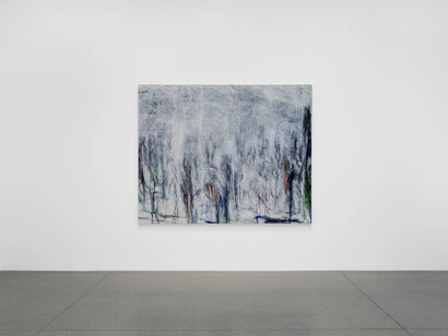
Although these works are abstract, their cascading morphology is akin to weeping willows, somewhat reminiscent of Monet’s Giverny landscapes. Yet in the French Impressionist’s late canvases, the strokes are much wider, looser and sparser. By contrast, Matsumoto’s canvases are not only denser but also feel deeper, as if holding an unfathomable depth within them. Working on a vertical canvas, Matsumoto embraces the weight and density of oil. Notably, she begins each painting by drawing with charcoal all over the canvas.10 With no image in mind, she moves her hand intuitively, allowing mind and body to become one in the act of mark-making. After a week or so, when the drawing reaches a certain threshold, she begins to sense a ‘light coming out of it’, and the ‘charcoal will invite green in’. She then switches to a paintbrush and continues to follow the lead of what is in front of her. As a final touch, she adds delicate scribbles of pastel, as though eliciting the viewer’s closer attention to surface details. Matsumoto has worked in both water and oil in her pursuit of luminosity in abstract painting. A number of variances between her water-based and oil-based processes can be pointed out, but the ultimate difference is time. Water demands almost immediate attention and reaction, whereas oil allows for sustained observation and reflection. After all, if the artist has to complete an acrylic painting in one day, she spends as long as one week letting her charcoal drawing mature enough for her to sense potential light and colour. While seeing light and colour in the black of charcoal may sound improbable or fantastical, this idea dates back, I would argue, to an ancient treatise on art.
The famous maxim Sumi has five shades (墨分五色; 墨に五彩あり) appears in On famous paintings through the ages (Lidai minghua ji), a text by the ninth-century Chinese art historian and theorist Zhang Yanyuan. Widely known in East Asia, the maxim speaks of the infinite range of possibilities for ink painting under an adept hand. Matsumoto’s case is unique in that she is an oil painter whose work developed out of a response to gestural abstraction in New York, and made use of a new Western material (acrylic) with familiar Asian properties (wateriness) and a new colour outside of the ‘five shades’ (pink). She applied her medium to a Western support (canvas) as opposed to an East Asian one (paper or silk), while she embraced in spirit a distinct affinity with the moist climate, which sets the archipelago (Japan) apart from the drier continent (China) and peninsula (Korea). Her so-called ink paintings in colour reflect how her painting process is responsive to nature and is constituted by the visual embodiment of an aesthetics of water.
Her movement between two different traditions, however, is linked by one fundamental element shared by two civilisations, and indeed, human civilisation as a whole: carbon. Her work references two forms of carbon as basic artistic materials: sumi and charcoal, and most significant to note is how she uses charcoal as a preparatory tool. She does not use charcoal to sketch out a morphological foundation or composition, as in the Western convention; rather, she uses her charcoal drawings to prepare an entry for light and colour, in a manner resonant with the East Asian employment of sumi ink. Thanks to these two carbon-based art materials, she has not only broken the long curse of poorly executed oil painting in Japan, but also joined the global ranks of contemporary painters who experiment with mediums and intermingle their histories. She has unified the spirits and methods of these two mediums to luminous effect. We may indeed argue: when oil and water are merged, light emerges from the paintings of Yoko Matsumoto.
Notes
1 Faor Atsuo Imaizumi’s critique and the debate resulting from it, see Yuri Mitsuda, ‘“Bijutsu hihyō”-shi (1952–1957) to sono jidai: “Gendai bijutsu” to “gendai bijutsu hihyō” no seiritsu’ [The magazine Bijutsu hihyō (art criticism) and its era: The formation of ‘contemporary art’ and ‘contemporary art criticism’], Fuji Xerox art bulletin 2, 2006.
2 Unless otherwise noted, this paragraph, including quotations, is based on Yoko Matsumoto, ‘Shikisai to shintai-sei’ [‘Colour and corporeality’], in Yoko Matsumoto, Hino Gallery, Tokyo, 2007, p.190.
3 For a detailed chronology, see Yoko Matsumoto, pp.194–203 (Japanese) and pp.204–8 (English).
4 Yoko Matsumoto, Intabyū [‘Interview’], Passport to Shangri-la, The Museum of Modern Art, Saitama, 2022–23, p.37.
5 Matsumoto, ‘Shikisai to shintai-sei’, p.190.
6 The painting is now on extended loan to the National Gallery of Art in Washington, DC, see here.
7 This paragraph is based on Matsumoto, ‘Intabyū’, p.37.
8 Matsumoto’s painting process is synthesised from ‘Gyararī tōku: Matsumoto Yōko x Takashima Naoyuki’, p.37; Matsumoto, ‘Shikisai to shintai-sei’, p.191; and her artist’s talk at White Cube, New York, 27 June 2024 (hereafter ‘gallery talk, 2024’).
9 Matsumoto, ‘Intabyū’, p.38.
10 The description of her process for the ‘green paintings’ is based on Matsumoto, ‘gallery talk, 2024’.