English
 Español
 Français
 Deutsch
 Italiano
 Português
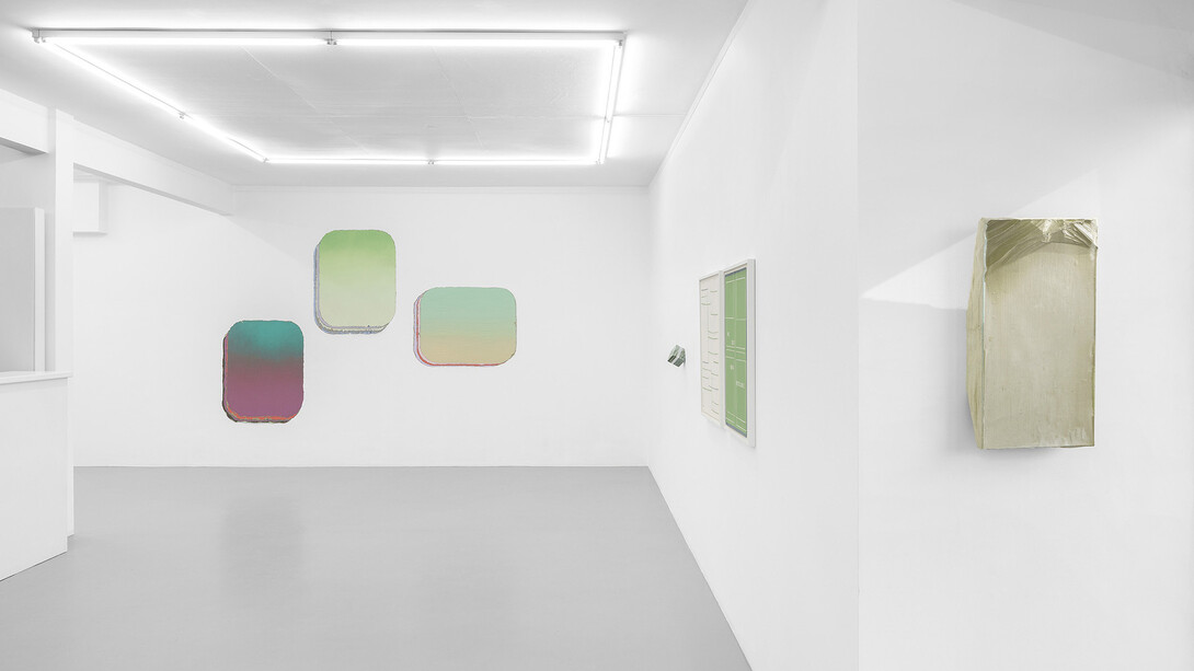
The color green is perceived by the human eye at the center of the visible spectrum, making it one of the most luminous and detectable colors. Yet our conception of the color spectrum does not include a clear distinction between the shades of the chromatic range. No boundary, even one chosen arbitrarily, clearly separates yellow from green, nor green from blue. Within this spectrum of visible colors, where each perceived shade corresponds to a specific radiation and wavelength, the approximate center of green can be located at 530 nanometers.1 The works gathered here fall, entirely nor in part, within this range. The degree of uncertainty that characterizes our subjective perception and categorization of colors mirrors the critical fate of the color green, whose reputation and semantic evolution have been as complex as they have been changeable over the centuries.
Traditionally difficult to produce, and even more difficult to fix, green is not only the color of vegetation; it is also, and above all, the color of destiny. Chemically unstable, both in paint and dye, over the centuries it has been associated with everything that is changeable, versatile, and ephemeral: childhood, love, hope, luck, games, chance, and money. It was only during the Romantic period that it definitively became the color of nature and, subsequently, that of freedom, health, hygiene, sport, and ecology. Its history in the West is partly one of a reversal of values. Long overlooked, unloved, or rejected, it is now entrusted with the impossible mission of saving the world.” 2
(Michel Pastoureau, Vert – Histoire d’une couleur, 2013)
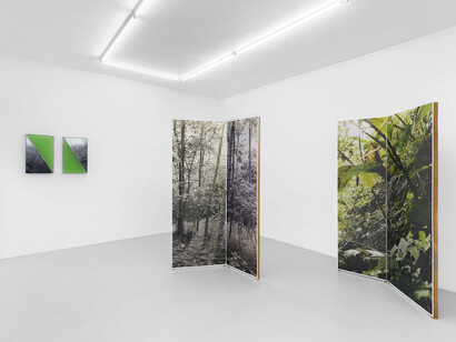
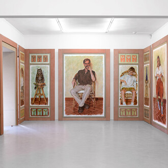
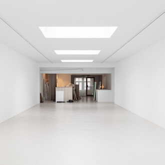
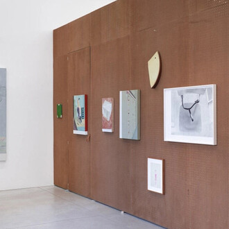
After a long period of ambiguity in ancient Greece, the first word to clearly designate the color green was the Latin viridis, which quite instinctively associates it with nature, growth, and vigor. It therefore seems logical to begin this exploration with the work of Stijn Cole, who offers both an analytical deconstruction of our perspective and a physical and sensory immersion in the landscape. The works on display (landscape photographs on glass or aluminum) are vibrant compositions that respond to their luminous environment. The naturalistic motif of vegetation is traversed by abstract lines of folds and bold swaths of color, which build bridges across art history between the figurative representation of landscape and abstraction.
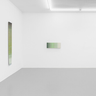
The poetic radicalism of a pure line in dialogue with color is evident in Bernard Villers’ work Poutre peinte, whose slanting form rests against the gallery window, suspended between natural and artificial light. This beam, which seems almost to have been placed and left there by mistake, is painted in oil in two different shades of green, top and bottom. Since the green on the underside is visible only as a reflection or through the transparency of the gallery’s glass, it is difficult to discern its exact shade and to perceive precisely the difference between the two hues.
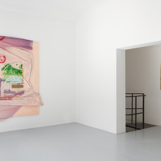
In Marija Rinkevičiūtė’s work, the landscape is neither literal nor figurative, but takes shape in the folds and wrinkles of a “skin-painting” in which every detail is imbued with the marks of time or gesture. One perceives the landscape as a reflection of the state of the soul, like the imprint left by a presence that has vanished. The work emerges from the wall, revealing the raw canvas as well as pictorial layers of various kinds, thus asserting itself as a sensitive zone defined by its materiality, since it is essential to remember that color does not exist on its own, but is the result of an encounter between light and matter.
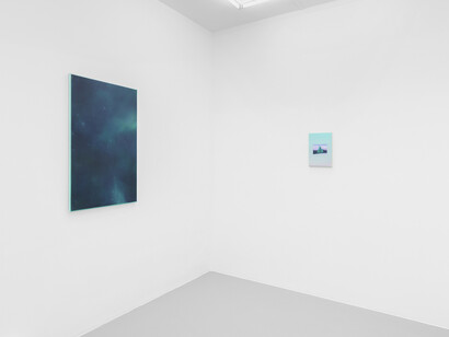
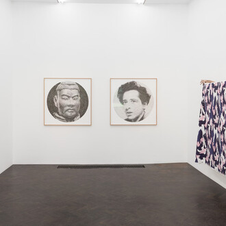
Further on, Guðný Rósa Ingimarsdóttir’s diptych raises the question of the reverse/hollow portrait3 or in a mirror, linked here to a need to represent oneself with modesty and reserve, without revealing too much, and to an identity that reveals itself through absence, the trace of what has been. The two works correspond and complement each other, since each is composed of fragments of the other, yet without ever forming a fully intelligible whole. The self recycles itself, transforms, and remains elusive.
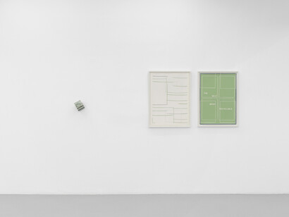
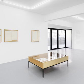
Fernanda Fragateiro’s work features pages from the book Self-portrait (1969) by art critic Carla Lonzi, sandwiched between two blocks of green marble; the book presents an experimental reinvention of the autobiographical genre through fragmented accounts of artists’ lives. It is a polyphonic literary work in which the classical genre of biography is transformed. This shift in perspective and paradigm allows for a questioning of the invisible structures underpinning the construction of art history. Here becoming the signifying material of a work of perfect geometry, the use of the book suggests a critical re-examination of abstraction and modernism.
Guillermo Mora’s Fondos also touch on the notion of genre, in painting rather than in literature (in academic painting, the hierarchy of genres placed history painting at the top, with the other specialties ranking in descending order of value: portraiture, genre scenes, landscapes, and still lifes). Landscape and portrait are also standard formats, vertical or horizontal, with which these stratigraphic superimpositions of “backgrounds” of painted colors play. There is also a shift in hierarchy in which the background takes precedence over the potential foreground subject—and is the background truly one if the foreground has disappeared?—which has here faded away in favor of flat areas of abstract color.
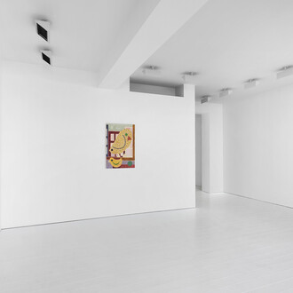
The background—against which a figurative painting gradually takes shape and whose color will determine the entire atmosphere of the composition—also fascinates Gauthier Hubert. He plays with the fundamental elements of painting (questions of typology, framing, and background) in Un véritable paysage de carte postale -je dépense donc je suisse (A true postcard landscape—I spend, therefore I am Swiss), in which he imagines an emerald Matterhorn that oscillates between portrait and landscape formats, and in Peinture infinie (Infinite painting), whose starry sky is built upon a vibrant and intense Veronese green background.4
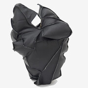
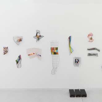
In the display case, an organic dialogue emerges between two works by Guðný Rósa Ingimarsdóttir and the sculptures by Tatiana Wolska. Where Guðný Rósa Ingimarsdóttir recycles her own persona, the intimate emotions and memories that fuel her works, Tatiana Wolska’s sinuous sculptures draw their material from a literal recycling of green plastic water bottles that are cut, heat-sealed, and reassembled by the artist. Through a process of visual transformation—one that one might almost imagine as an alchemical transmutation—Tatiana Wolska brings about a living metamorphosis of forms.
(Text by Amélie Bataille)
Notes
1 Light is electromagnetic radiation, and each photon (particle of light) has a wavelength; the distribution of wavelengths in a radiation forms its spectrum. The eye responds only to wavelengths
within the visible spectrum, which ranges from approximately 380 nm to 700 nm. According to the AFNOR X08-010 standard “General methodological classification of colors,” greens are colors whose dominant wavelength lies between 490 and 573 nm.
2 Michel Pastoureau, Vert – Histoire d’une couleur, Paris, Points, 2020, p.8.
3 The negative portrait, or anti-portrait, is a literary and artistic technique that involves defining a person, an object, or a situation by what they are not: through contradiction, through a trace, or through absence.
4 “[…] that murky, grass-green hue—an ideal and fabulous green, in which ultramarine predominates and which painters call Veronese green.” Théophile Gautier, History of dramatic art in France over the past twenty-five years, vol. 1, Brussels, Hetzel, 1858, p. 61.