English
 Español
 Français
 Deutsch
 Italiano
 Português
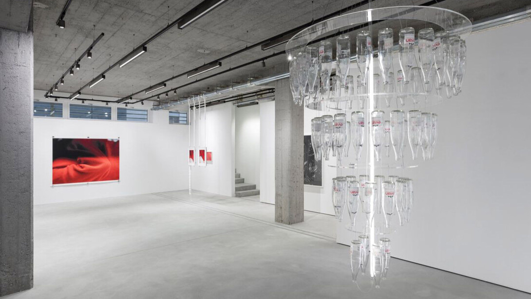
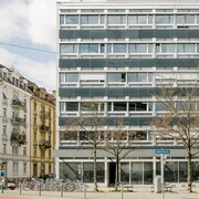
Since Tobias Kaspar prefers not to give interviews himself, Samuel Haitz—who is deeply familiar with Tobias’s work—agreed to speak with Ramona Diem (Galerie Urs Meile) about the exhibition Atelier at Galerie Urs Meile in Zurich. Their conversation also touched on broader questions of art, fashion, authorship, and production within Kaspar’s practice. Samuel Haitz (b.1997, Muri) is an artist. He lives in Zurich and is currently an artist-in-residence at Wiels in Brussels.
Tobias Kaspar (b.1984, Basel) has lived in Zurich since 2018. Before that, he worked in Berlin, New York, Rome, and Riga, where he still maintains a residence. He became known in the early 2010s for photographic and installation-based works that explore questions of identity, authorship, and consumption within the context of appropriation, conceptual art, and institutional critique. Kaspar repeatedly develops experimental exhibition formats—for instance the anonymously realized solo exhibition Independence (Kunsthalle Bern, 2018), The street (Cinecittà Film Studios, Rome, 2017), or most recently Rented life (MAMCO Geneva, 2022; Migros Museum für Gegenwartskunst, Zurich, 2025). Kaspar is also a co-founder of the artist and publishing collective Provence, of which Samuel Haitz is likewise a member. Since 2009, Provence has been published regularly in print and digital formats and understands itself as an agency for contemporary art.
Ramona Diem: In Atelier, Tobias Kaspar directs his focus toward his textile photography—toward fabrics, surfaces, and gestures that oscillate between fashion, art, and the everyday. How do you view Tobias’s photographic approach?
Samuel Haitz: People sometimes laugh when I call art “sexy”. With Tobias, that’s often my reaction: “sexy.” It has very little to do with eroticism, but a lot to do with other forms of fetish—materiality, surface, a genuine desire for art, and perhaps also humor, which can be attractive in its own way. Tobias plays with these many forms of allure. Sometimes his work affects me in the same way a good advertisement does—I may not want to buy the product shown (I really don’t need another sweater…), but I identify with the brand, the attitude behind it. Tobias’s photographs are compositionally and aesthetically strong images that simultaneously open up systems of reference beyond the literal surface. But I think it falls short to say that Tobias is “interested in fashion,” as is often claimed. It seems far more interesting to consider how he illuminates certain mechanisms of the fashion world—how it draws on art history, for example—by adopting these strategies and bringing them back into artistic practice. To answer your question: photography is a logical medium for this play with strategies and languages borrowed from fashion and advertising. Tobias’s camerabased works often involve a kind of probing—here, in this exhibition, it is textiles, but also the bodies wearing them, that are examined in their materiality.
RD: Let’s talk about the individual works in the exhibition in more detail. There are photographs of various garments, and there are photographs of shoeboxes. The box serves as a shell for a product, just as textiles ultimately envelop the body.
SH: I still remember clearly the first time I got my own new iPhone. I drove home from the Apple Store with my father and unpacked it in the car. The lid is designed so that you feel a slight resistance when lifting it. Then the iPhone lies perfectly fitted inside: a shiny black surface. This packaging is meticulously planned; it is an essential part of the user experience, of the marketing. Unboxing videos are a whole category on social media. Luxury fashion works in a similar way: when I buy a garment for several hundred francs, I am not just buying a status symbol or hopefully good design, but also an “experience”. Suddenly it becomes important that the shoebox has just as much aura as the shoe—even if I immediately throw it away at home. Luxury online shops, which Tobias is also interested in, undermine this principle in interesting ways. I order from the high-price segment, but the delivery feels like a Zalando package. The analogy of clothing as packaging for the body is somewhat banal, but if you apply Apple’s packaging principles to the body, you can see that fashion can highlight the qualities of its wearers in a similar way.
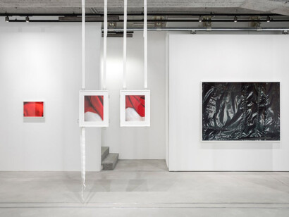
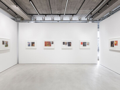
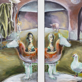
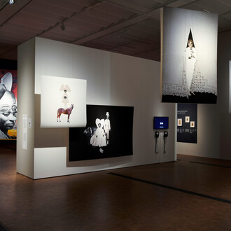
RD: The exhibition contains two references to the French artist Henri Matisse. First, quite concretely, in the series Love under capitalism (2025), a group of eight frames, each consisting of at least two photographs and a text fragment printed on the mat. This combination of image and text is a recurring strategy in Tobias’s work. With series such as Lumpy blue sweater (2010) or Bodies in the backdrop (2013), Tobias received early institutional recognition. The reproduced Matisse paintings are cropped so that only textiles, wallpaper, and décor remain visible. Alongside these, Tobias places screenshots from a Chinese commercial featuring an androgynous-looking person.
SH: These image-text combinations—evoking, among others, Louise Lawler—were probably the first works of Tobias that really caught my interest. In the early works mentioned, the relationship between image and text was still clearly legible; later they became more playful and abstract, at times almost nonsensical. More specifically regarding these new pieces: a fascination with how fashion works always goes hand in hand with an interest in the generic. When I bought a Labubu in recent months, I was also buying into a trend. But trends wear out—precisely because of their own success. The real art lies in striking a balance between belonging and individuality. No one wants to seem like they are merely following the crowd. How we receive Matisse is telling in this regard. Les nus bleus have become merchandise—posters hung in the kitchens of the “uninterested”. Those of us “in the know” turn up our noses—not because we think the works are bad, but because they have been absorbed too commercially. The Matisse works Tobias uses here fall into another category—the category of good taste. By cropping the reproductions, Tobias appropriates these paintings but also redirects our gaze. His interest in surface, materiality, and perhaps the painterly gesture becomes underscored. The Chinese commercial Tobias pairs these with was filmed in the guesthouse of a collector in Shanghai, where he stayed during an exhibition installation last year. While Tobias turns the Matisse images into still lifes, the screenshots emphasize the activation of the setting through the figure interacting with it. In the end, however, both bourgeois interiors appear equally distanced in his works. It is unclear who is speaking in the captions printed on the mats—it seems to be neither Tobias, nor Matisse, nor the person in the screenshots. The text fragments rub up against the imagery but never fully align with it. As viewers, we can feel somewhat lost with these works—a feeling Tobias repeatedly seems intent on provoking.
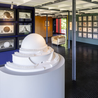
RD: The exhibition is titled Atelier, and Tobias mentioned L’atelier rouge, from the New York MoMA collection, in the lead-up to the show. Matisse painted his studio in red. Paintings hang and stand within the space; it is a kind of exhibition within an image. How does Tobias relate to the idea of the studio?
SH: It makes sense that Tobias likes L’atelier rouge. The painting shows a composition that seems to have accumulated almost by accident through everyday studio practice. Some of the paintings Matisse reproduces in it feel sculptural; some are stacked; some perhaps unfinished. It reminds me of Tobias’s exhibitions, in which works do not simply hang on the wall in an authoritarian way but often take on an object-like character.
The question of the studio as a site of production may not be so interesting today. My father used to oversee outsourcing/offshoring projects for a major bank—moving IT jobs from Switzerland to India, for example. It may be unromantic to think about art production this way, but in a globalized world it seems relevant to ask where certain expertise can be found, and at what cost.
Tobias makes this globalized production a theme in his work, for example with the recently created Lumpy purple can (2025), conceived in Switzerland and fabricated in China, which—via a text printed on it— describes itself in the first person and recounts its journey from Asia to Switzerland. Or with the serially produced snow globes Bartleby (My dreams and nightmares) (2024) for an exhibition in Shanghai, likewise manufactured in China. This playful engagement with industrial production contrasts sharply with works in which the artistic gesture—the studio labor—is almost exaggerated: painting, drawing, collaging, carrying out each step by hand. The studio is not necessarily a fixed place, even if such a place exists. Tobias also produces at home, after his daughter has gone to bed, or in a hotel.
RD: The central work in the exhibition is Anti-conformist conformist chandelier (Evian) (2025), a chandelier made from seventy Evian glass bottles.
SH: When Tobias first told me about the idea of making a chandelier out of empty Evian bottles, I threw up my hands. Chandeliers—especially contemporary reinterpretations of them—are, in my opinion, rather tasteless. But if we look back at everything we’ve discussed so far, the work becomes quite interesting. The mechanisms of marketing and belonging are almost nowhere as evident—and nearly perverse—as in bottled water. Sure, one may taste slightly better than another, but ultimately the purchase decision hinges on branding. Perrier, which I’ve been drinking a lot in Brussels, carries a hint of hedonistic pleasure, even though little about it is truly luxurious. “Who benefits from a bad life?” I wonder, refilling my glass halfway and washing down methylphenidate and ibuprofen. Evian’s brand identity, by contrast, focuses not only on exclusivity but also on wellness and health. The Evian slogan (“Live Young”) seems to promise that mountain spring water alone can cure my dopamine deficiency, my headaches, my blemished skin, and the stress that caused them.
RD: Finally, I’d like to discuss one aspect that makes Tobias’s play with art reproduction and everyday objects particularly vivid: the fridge magnets.
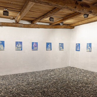
SH: For Atelier, Tobias has produced magnets that reproduce the works in the exhibition as well as other classics from his practice. He is, of course, referencing similar products sold in museum shops, which usually depict non-contemporary artworks. One could dismiss this as a form of self-historicization, but I see it more in the tradition of merchandise—whose similarity to artist editions Tobias continually explores, for example with his jeans brand or the Harlequin teddy bears. I’ve already mentioned the idea of good and bad taste—and a reproduction of an artwork on a magnet is almost certainly the latter. What’s interesting about Tobias is that he knows this, makes the magnets anyway, and somehow manages to make me want to put one on my fridge.