English
 Español
 Français
 Deutsch
 Italiano
 Português
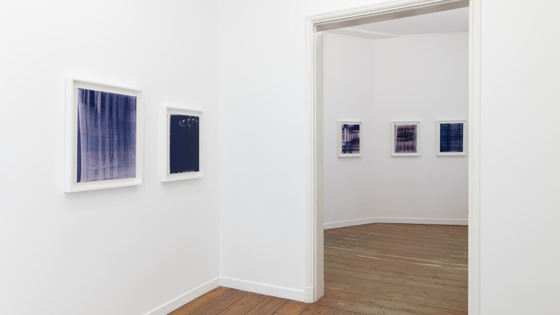
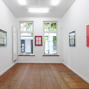
Receding depths of blue.
Goethe once wrote that color is a degree of darkness. For him, darkness was not so much the absence of light, but rather its very opposite. Both light and darkness existed as entities in their own right, yet always in relation to each other. Color, in Goethe’s vision, was born out of the interplay between the two. In this, he opposed Newton’s prevailing color theory, which begins with white light and still sets the scientific standard today. Although Goethe’s propositions have been scientifically refuted, anyone standing before the work of Paul Czerlitzki cannot help but feel that Goethe had intuited something essential.
According to Schopenhauer, Goethe wrote about physiological colors as phenomena in themselves, as they appear to our perception. He did not so much formulate a refutable or measurable theory, but emphasized sensation—the sensory perception of colors. This sensoriality of color, and of darkness, is inescapable and immediate in Czerlitzki’s work. The pigment becomes not only tangible but also unfathomably deep. Color becomes haptic, while also taking on spatial, expansive, and unbound qualities.
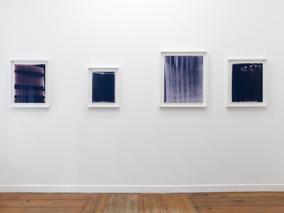
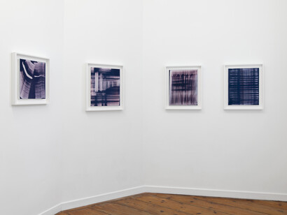
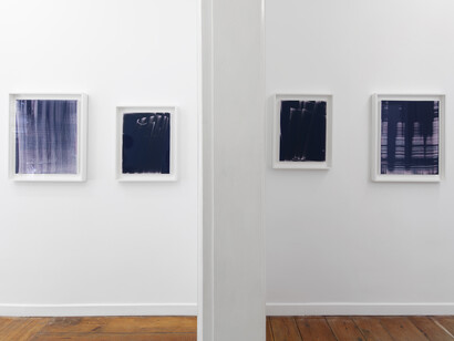
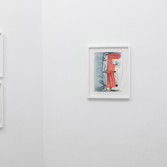
In the Relay series, Czerlitzki builds his works by allowing dark pigments to accumulate onto a white canvas. Layer upon layer of pigment is collected on the canvases over long stretches of time, up to two years. As such, the artist makes the works grow slowly while they are lying or hanging in the studio. Through this accumulation, colors are crystallizing and deepening progressively. He stacks pigment upon pigment, creating not only a rich texture but also a chromatic density that recedes far into the canvas. What, after all, does a deep color actually entail? In Czerlitzki’s work, depth becomes manifest in the layering itself, in the way a color reveals its manifold shades— as though its very spatiality were unfolding before our eyes. Rarely do we see simple planes of color; rather, we encounter gradations of pigment that seem to sink ever deeper into the canvas.
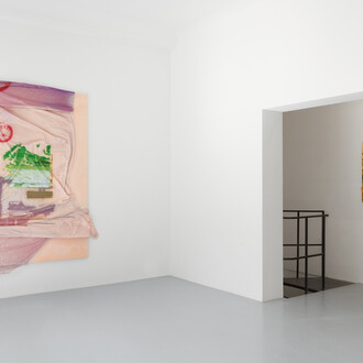
This effect is heightened by the presence of the white canvas, which the artist deliberately allows to shimmer through or leaves uncovered in places, rendering the pigments all the more tactile, the contrasts all the more resonant. The very weave of this canvas, too, plays an explicit role. This is most explicit in the series Untitled, where Czerlitzki applies pigment onto canvases through another canvas. The very weave of that canvas is then imprinted, almost as if it were the grid of a screenprint. In the Relay series, in contrast, the fabric of the canvas is mostly present in the areas that collected less pigment, or where pigment was removed. In both cases, the fabric’s woven texture imparts a tactile dimension to the pigments. With its minute topography, it lends the colors both material presence and a certain resistance. Veils of light gush or flow across the intensely dark color spaces; perception oscillates between the minerality of the pigment, the spatial dimensions of color, and the palpable tactility of the surface.
Some layers of pigment, Czerlitzki removes or reworks. Accidents and contingencies in the studio—incidents within a given layer—are allowed to remain as traces or inscriptions in the painting’s surface. Through their continuous exposure to occurrences in the studio, their layers of pigment become lived-in and often scarred. In some exhibitions, the works are exposed to the touch of visitors, in others, they are temporarily frozen in cases. This interplay between control and contingency animates the work, as though each canvas were a living organism, patiently shaped, yet never fully controlled.
The Relay series is characterized by its profound blue pigment. For Goethe, the color blue emerges when black is lightened—the darkness of black tempered by light to yield blue. Although the additive process of Czerlitzki works in the opposite direction, the works seem to draw blue out of the darkness, pulling veils of light into that immeasurable color. As such, the Relay works can be characterized as a dynamic between surface and depth, between the layering of pigments coming forward, and profound fields of color receding into the surface.
“Blue transcends the solemn geography of human limits,” wrote filmmaker Derek Jarman in curiously spatial terms. It is no surprise, then, that deep blues and purple hues play a central role in many of Czerlitzki’s works. The color that was drawn out of darkness, built up layer by layer, embodies a profound spatiality that perhaps hovers just at the threshold of the tangible.
(Text by Louis De Mey)