English
 Español
 Français
 Deutsch
 Italiano
 Português
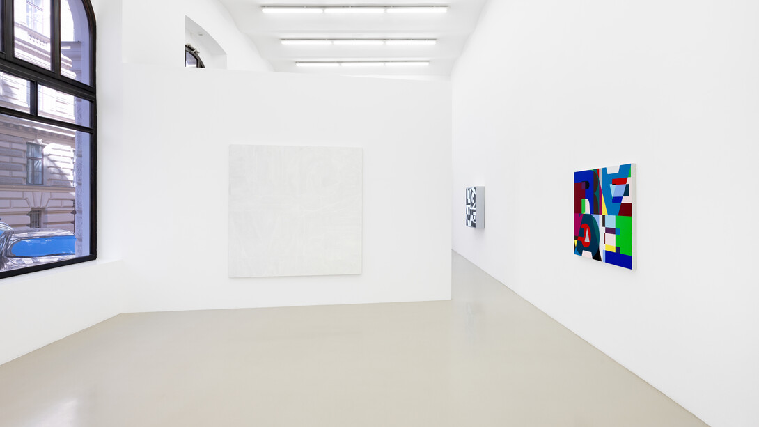
Since the 1980s, the ‘anti-essentialist system’ practiced by Heimo Zobernig has functioned as a consistently applied negative dialectic in his art. Within this, Zobernig regularly explores the question of the manipulation of realities.
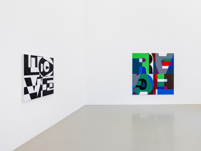
In untitled (Love/Hate) for example, the use of extra-bold Helvetica letters—a font typical of modernism—serves to appropriate and reinterpret Robert Indiana’s painting (Love, 1966), for which he had chosen a 19th-century typeface: Clarendon Bold. In 1987, Zobernig’s motif was then politically adopted by the Canadian group General Idea for an ‘Art against Aids’ campaign and adapted into an AIDS emblem.
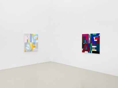
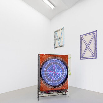
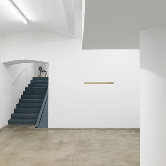
Since 1986, Heimo Zobernig has been using the sans-serif typeface Helvetica for catalogue and poster designs. Once celebrated as an icon of the Swiss Style, Helvetica increasingly lost its prestige during the 1980s. Among typefaces, it became something like chipboard among furniture woods. Its form appears so neutral that the viewer forgets that it is a typeface. From 1990 onwards, Zobernig began to label his exhibitions consecutively from A to Z using Helvetica letters. In 1993, he designed a poster for a group exhibition in orange, brown, grey, black and white, in which the word Real appeared for the first time. A year later, the first Real paintings were created in the same colours.
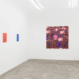
Initially, four letters r-e-a-l in a sans-serif typeface filled the entire canvas, dividing it into four equally sized panels. Zobernig composed the letters from a fixed arrangement of differently colored geometric shapes. Step by step, Zobernig expands the color palette of the Real paintings and eventually adds the word Egal (meaning ’whatever’) which now fills the canvas to the same extent as Real. The words appear to be written one inside the other; their meaning is negated. A new interpretative starting point of complex construction has been reached.
Later paintings also follow the same template; differing only in their color combinations. Zobernig leaves the interpretation of this mosaic to the viewer. Upon a closer look the circles and rectangles form further letters turned upside down. From the world-assuring r-e-a-l, arbitrariness ultimately emerges once more: e-g-a-l. The composition of the spatial relationships and colour tones on the canvas results in a work that is both gently humorous and aesthetically pleasing, without being purely functional or purely visual.
As Helmut Draxler notes, the image here literally names a situation without fulfilling it.
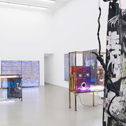
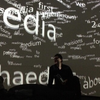
As seen in the previous gallery exhibition, Splendid playground, Ei Arakawa-Nash—who is representing Japan at this year’s Venice Biennale—has also collaborated with Nikolas Gambaroff to create a play on letters, known as Two-alphabet monograms, as a dysfunctional written and spoken language.
Similar to Heimo Zobernig’s method, this involves constantly exploring the productive and interpretative possibilities of traditional artistic practices. Through their deliberate engagement with their respective media, both artists raise questions about process, institutional context and performativity.
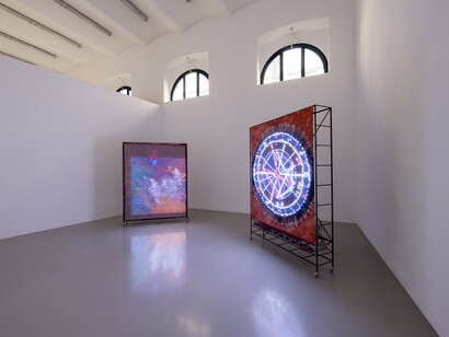
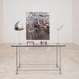
As Ei Arakawa-Nash does not produce paintings himself, he is constantly reliant on the works of other artists, which leads to a kind of duplication of these within his work, whereby he continually slips into other identities. In his work Cologne of the Maghreb (Bodyphilia song) (2016), created for his exhibition at the Museum Ludwig, he referenced the Cologne painter Michael Buthe (1944–1994), with whose works he feels a strong conceptual and identity-based connection. He has thus created an installation featuring a singing LED painting that explores issues of identity and body politics.
In 2018, Arakawa-Nash explored the performative potential of LED paintings in the work Harsh citation – Harsh pastoral – Harsh münster, head of installation at the Kunstverein Düsseldorf, proposing an alternative interpretation of performance art. Eight LED works were subjected to astrological analyses by the American artist Sarah Chow, based on their respective times and places of birth. Among other works, Tony Conrad’s performance 7360 Sukiyaki (1973) was literally addressed as a ‘person’ in Arakawa-Nash’s multimedia LED work including its respective psychological idiosyncrasies. How do performances think and feel?