English
 Español
 Français
 Deutsch
 Italiano
 Português
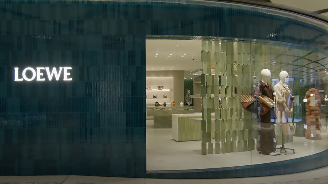
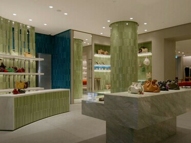
In an age when luxury brands compete for consumer attention with ever louder campaigns, Loewe’s retail philosophy whispers rather than shouts. The Spanish fashion house, under the creative direction of Jonathan Anderson since 2013, has carefully recalibrated its visual language across stores globally. This image of a Loewe storefront presents a prime example of the brand’s retail strategy: a deliberate fusion of architectural austerity and artistic elevation. While many fashion retailers rely on spectacle, Loewe opts for structural sophistication and tactile allure. The image captures a near-monastic retail interior framed by an eye-catching façade of deep blue ceramic tiles, subtly echoing both Mediterranean heritage and modernist codes.
This article will deconstruct this visual encounter, situating Loewe’s design within broader themes of architectural minimalism, spatial hierarchy, and contemporary luxury. It will examine the brand’s display choices, material contrasts, and spatial composition to ask: how does Loewe communicate luxury without traditional markers of opulence? What is being communicated through restraint, geometry, and silence?
The power of framing: a portal of precision
The façade of the Loewe store acts as both a boundary and an invitation. Deep ultramarine ceramic tiles, vertically ridged and carefully aligned, compose a textured frame that visually isolates the store from its surroundings. This highly saturated ceramic surface, reminiscent of Iberian tilework, references the brand’s Spanish roots while embracing the controlled geometry of modernist design. The tiles are neither glossy nor overly decorative—they absorb just enough light to feel architectural rather than ornamental.
This blue frame functions like a picture window, turning the store into a curated diorama. The large, uninterrupted glass pane—typical of modernist retail design—eliminates any barrier between consumer and product. It signals transparency, openness, and confidence. The glass does not obstruct; it reveals.
Moreover, this frame can be read as a sculptural gesture, echoing Donald Judd’s minimalist forms or the solid voids of Tadao Ando’s architecture. Loewe does not crowd its windows with mannequins or props; instead, it offers a single, sparse composition—a mannequin in a sharply tailored suit and a lone bag on a marble pedestal. This is not retail as excess. It is retail as curation.
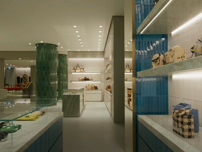
Monuments to materiality: the interior language
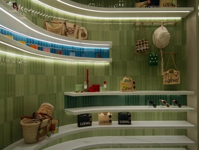
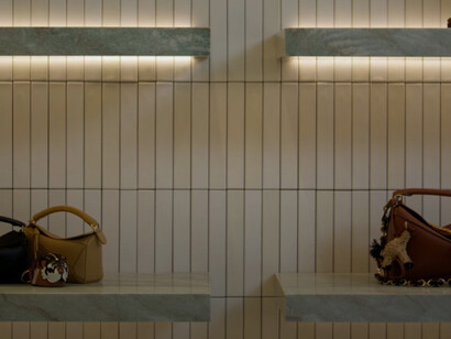
Step past the portal, and the aesthetic vocabulary deepens. The interior is built on a palette of mineral tones and industrial finishes: polished steel fixtures, soft grey floor tiles, brushed metal shelving, and stone plinths. This combination of materials—stone, steel, and glass—recalls the minimalist interior architecture of art galleries or high-end ateliers.
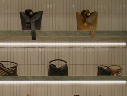
One notable feature is the green marble pedestal placed asymmetrically in the window. It elevates a single leather handbag, lit with surgical precision. This display references both classical sculpture (the pedestal) and modern museology (the isolation of objects). By placing the bag on stone, Loewe elevates it not just physically but metaphorically: it becomes an artifact, worthy of contemplation.
This interior spatial philosophy aligns with Loewe’s broader brand identity—an emphasis on tactility, artisanship, and longevity. Jonathan Anderson has repeatedly positioned Loewe as a “craft luxury” house, interested in making timeless objects rather than seasonal trends. The store’s interior echoes this ethos through its architecture. There are no flashy digital screens or loud colors. The space suggests that the luxury lies in the materials, the construction, and the spatial calm.
The mannequin and the void: curated absence
The mannequin at the center of the window display is an interesting study in reduction. Dressed in a sharply structured black or dark brown suit (depending on lighting and angle), it projects authority, anonymity, and discipline. There are no accessories, no movement, and no narrative gestures—just form and silhouette. The lack of visual clutter draws the viewer into a consideration of proportion and posture.
This visual restraint recalls the minimalist installations of fashion designers like Helmut Lang or Phoebe Philo’s Celine—designers who believed in the expressive power of silence. The choice to display a single mannequin against a backdrop of industrial steel columns is deliberate. The mannequin becomes a totem in an otherwise empty shrine.
Loewe seems to understand what many brands forget: in luxury retail, space is a language. To leave areas empty, to allow for spatial breathing, is to assert control. The void becomes a symbol of privilege. In crowded cities, in overstimulated lives, the gift of space is luxurious.
Architectural echoes: modernism, museum, monastery
The architectural DNA of the Loewe store borrows heavily from modernist architectural traditions, particularly those rooted in brutalism and mid-century rationalism. The exposed steel beams that divide the interior space suggest functionality and strength. They are not hidden; they are celebrated. Much like Mies van der Rohe’s open-plan designs, this store resists decoration in favor of structural honesty.
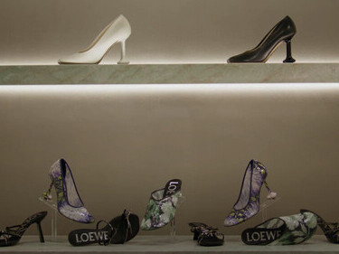
At the same time, the tonal uniformity and grid-like flooring evoke the spatial sensibility of contemporary museums. Everything is designed to recede—to let the objects speak. Loewe’s bags, coats, and accessories are not crammed into racks or loaded onto shelves. They are given their own pedestals, their own quiet.
There is also something monastic about the store’s atmosphere. The muted lighting, the sparse arrangements, and the focus on singular pieces all evoke a spiritual reverence for design. This is not just a place to shop; it is a place to observe and reflect. The consumer is positioned not as a buyer, but as a beholder.
Beyond fashion: Loewe’s artistic language
Loewe’s physical retail design reflects its wider cultural ambitions. Under Anderson, the brand has increasingly aligned itself with art, craft, and intellectual aesthetics. Through the Loewe Foundation Craft Prize, exhibitions at Salone del Mobile, and collaborations with artists like Anthea Hamilton and Alvaro Barrington, Loewe has positioned itself as more than a fashion brand—it’s a cultural actor.
The retail space continues this narrative. The use of marble plinths, museum-like lighting, and unbranded spatial zones (no overwhelming logos or slogans) turns the store into an art installation. Even the choice of how bags are displayed—upright, spaced, subtly lit—mirrors the conventions of gallery design. The store is not simply a place to buy luxury goods; it’s a curated spatial experience.
This strategy reflects a broader shift in luxury retail. As consumers become more visually literate and culture-conscious, they demand environments that match their sophistication. Loewe is not selling handbags; it is selling values—craftsmanship, intelligence, and discretion.
Branding through restraint: anti-luxury as luxury
In the context of global luxury retail, where many flagship stores are themed like immersive installations or visual cacophonies, Loewe’s minimalism stands out. It operates on what could be called “anti-luxury”: an aesthetic that rejects surface flash in favor of depth. The materials are expensive, yes—but not ostentatious. The design is complex—but appears simple.
This is not a strategy of exclusion but of refinement. The brand’s identity is expressed not through maximalism but through the confidence to do less. The spaciousness, the quiet lighting, and the intellectual display logic—these all position Loewe as a brand for connoisseurs rather than consumers.
And this is where Loewe’s retail design becomes revolutionary: it trusts the viewer. It does not oversell, overpopulate, or overdecorate. It gives you space, invites your attention, and assumes you understand. It is a luxury of mutual respect.
The blue ceramic façade: a signature in silence
Returning to the façade, it becomes clear how masterfully it anchors the brand’s spatial philosophy. The deep blue ceramic, with its ridged texture and matte finish, is both sensual and reserved. It recalls the Mediterranean sun, ancient tilework, and modernist rigor—all at once.
This choice of ceramic as an architectural material is significant. Unlike glass or steel, ceramic is handcrafted. It requires care, time, and skill. By choosing such a material for its outermost skin, Loewe aligns itself with the values of slowness, artisanship, and tactile beauty.
In a marketplace flooded with digital signage, neon branding, and retina-burning displays, this façade—quiet, physical, tactile—feels radical. It demands your presence. You must stand still, look closely, and feel the temperature of the blue.
Loewe and the future of fashion spaces
Loewe’s retail store, as captured in this image, offers a case study in the evolving language of luxury branding. It rejects spectacle in favor of spatial purity. It exchanges advertising for architectural narrative. It replaces consumer frenzy with contemplation. Through its material choices, display logic, and atmospheric precision, Loewe transforms shopping into a sensorial and intellectual experience.
In doing so, it participates in a larger cultural movement: the redefinition of luxury as quiet, slow, and smart. In a world that moves too fast and speaks too loud, Loewe invites us into a space of stillness. A space where a handbag on marble is not a product but a proposition. A promise that craftsmanship, culture, and clarity still matter.
And in that promise lies the future of fashion—not as noise, but as nuance.