English
 Español
 Français
 Deutsch
 Italiano
 Português
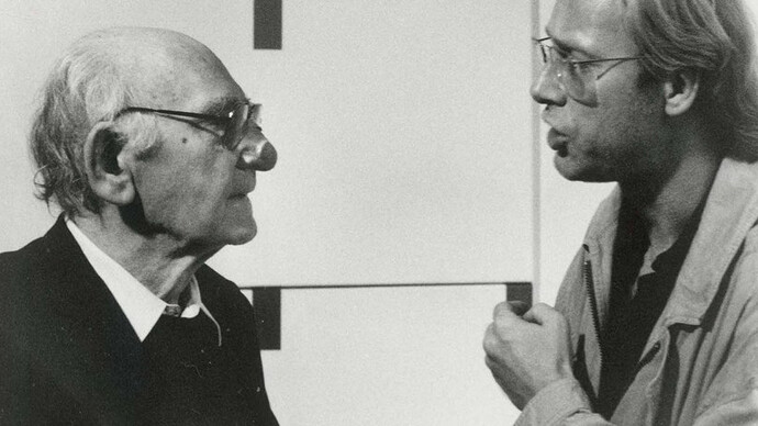
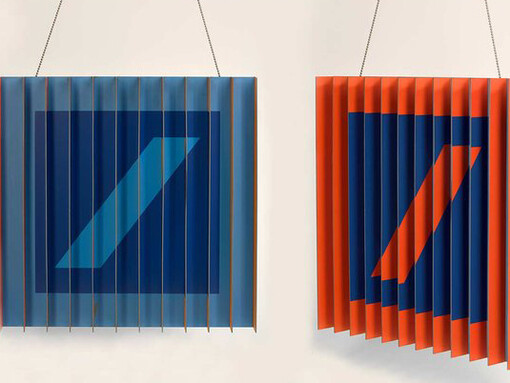
Logos, signage, corporate identity: The components that are now part and parcel of every company’s image were still in their infancy in the mid-20th century. The Stuttgart graphic design studio of Stankowski + Duschek was pioneering in this development a leading firm in the field of communication design for decades. Famous trademarks and well-known company images emerged from the partnership, including those of Deutsche Bank, Viessmann and Messe Frankfurt. The constructive aesthetic of the signage systems reveals the influence of Concrete Art that both Anton Stankowski (1906–1998) and Karl Duschek (1947–2011) found inspiration in during a similar period.
“Signs are like visual telegrams, similar to flags.” When Anton Stankowski formulated this insight in 1978, he was already one of the day’s leading figures in advertising[JB1] graphics. After having made a name for himself in the Swiss avant-garde during the 1930s, he went on to establish a reputation as a pioneer in graphic design with the studio he founded in Stuttgart in 1951. Brand design, considered the ultimate discipline in visual communications, belonged to his repertory from early on. Stankowski’s ability to shorten complex messages in the style of a telegram and to condense them into memorable sign systems would develop into his signature style. Equally distinctive was his versatile approach bringing typography, photography and painting into touch with graphic design.
Stankowksi discovered a like-minded associate in Karl Duschek, who joined the firm in 1972 and soon became a partner. He, too, was both a graphic designer and a visual artist. The melding of art and design, of fine and applied arts, characterised the output of the graphics studio that soon operated under the name Stankowski + Duschek, and would continue to do so until 2011 under Duschek’s leadership after Stankowski’s death in 1998. The reduced forms, geometric shapes, clear colours and analytical structures seen in the two designers’ Concrete Art works found their way into their graphic communication signs and systems.
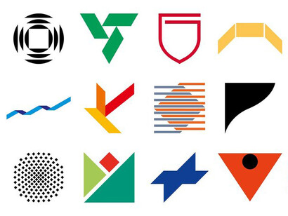
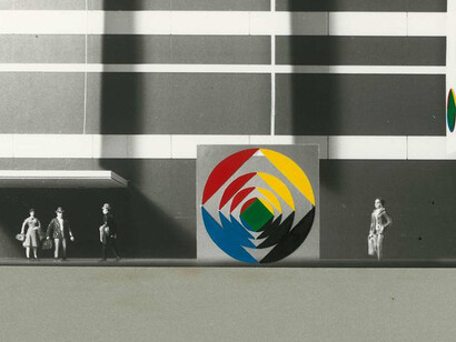
Brand development, corporate identity and informational graphics constituted the core of Stankowski + Duschek’s business for five decades. In addition to the “forward slash in the square”, which became world-famous as the trademark of Deutsche Bank, their agency also created logos for SEL, Werkbund, the Rat für Formgebung, Rewe, BKK, MüRück, PapStar, Deutsche Börse and many others. Anton Stankowski also designed the Berlin layout that would become the city’s visual identity as of 1969. The partners produced a comprehensive company image for firms such as Viessmann before the term corporate identity had even reached Germany, with numerous universities, hospitals, major events and trade fairs commissioning their orientation and guidance systems from their design studio.
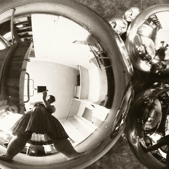
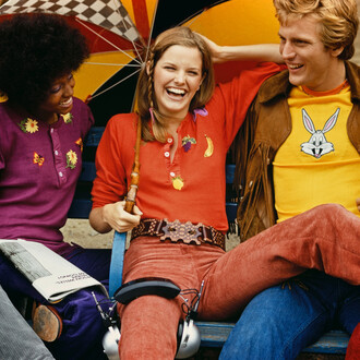
The display includes some 300 works covering the output of the Stankowski + Duschek design studio as well as of Stankowski’s previous office. A broad spectrum of sketches, variations, and executed designs, as well as a large amount of resulting printed matter ranging from advertisements to company typefaces, illustrates the working methods of a communication designer prior to the routine use of computers. In a dialogue with the non-commercial visual works the boundaries between art and advertising dissolve.
Many of the exhibited works stem from the extensive estate of Stankowski + Duschek commercial art donated to the Kunstbibliothek, Staatliche Museen zu Berlin by Karl Duschek’s wife Meike Gatermann in 2012. Loans from the Stankowski Stiftung in Stuttgart supplement the presentation.