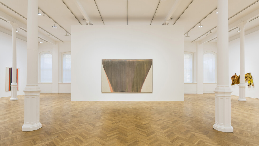
It could only have come from the United States and it definitely could only have been from the late 1960’s to the early 1980’s. IMPULSE, a group show at Pace, London, featuring a star line-up of Kenneth Noland, Morris Louis, Sam Gilliam, Ed Clark and Frank Bowling, sheds light on the lesser-seen-in-Europe, giants of post-war abstraction, where one reigns supreme: Sam Gilliam.
It’s impossible not to see the exhibition without considering the recent commercial and institutional resurgence Gilliam’s career has experienced – the Hail Mary of all Hail Mary passes, at 83, makes his inclusion in IMPULSE all the more noteworthy and because of this, Gilliam’s work has a refreshing newness that is steeped in historical importance. His deft employment of colour, as evidenced here, is impeccable and utterly insatiable for the viewer just as his underdog story is.
That is not to say that the other artists retain any less talent, but that their visual syntaxes are well known and come already historically validated. For example, a concern of many abstract painters at this time was a desire to break down the distinction between painting and sculpture in order to create paintings that were physical objects as much as they were abstractions.
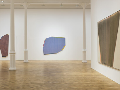
Immediately upon entering the gallery, on the far left wall, Noland’s Indo (1977), catches the viewer’s eye as a prime example of this. The canvas is shaped as an irregular polygon with the surface painted in a dull, dusty blue. The paint has been applied so thinly that at intervals across the surface there are what looks like printer misfires. Along four of the sides are thin bands of colour accentuating the either elongated or shortened sides of canvas; red and pink, dark blue, purple and turquoise, green and yellow, highlighting the irregularity of the canvas shape and presence on the wall. Likewise, across the room and on the opposing wall, Gilliam’s May III (1972) and (P.A.C.), And Then (1970) have their edges bevelled, a technique that allows the bleeding of the acrylic to take on a physicality not too dissimilar to looking at a piece of marble and, again, draws attention to the paintings’ sculptural presence when displayed on the wall.
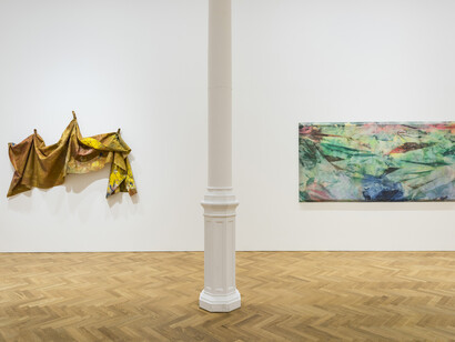
To their left, Gilliam’s sculptural exploration reaches new heights within the exhibition with the climactic After Micro W #2 (1982). A dark yellow sheet of polyester is knotted and pegged to the wall at the top so that the rest of the sheet, splattered and dyed with loud pinks and yellows and bold purples and white billows and folds off the wall in a state of suspended motion.
Elsewhere, the exhibition settles into a comfortable rhythm, it’s not overpopulated but neither is it too thin on provide a concise overview of this period. Louis’ Number 1-71 (1962) is just such a work. On the tall off-white canvas are thin stripes of poured red, yellows, blues, oranges, purples and green that start from near the top of the canvas and continue to the bottom.
Louis and Noland visited Helen Frankenthaler’s studio in 1953, where they saw and were greatly impressed by her stain paintings. After their return to Washington, Louis and Noland experimented with various techniques of paint application – the culmination of which, it can be said, is seen in Louis’ final series of works: his stripe paintings.
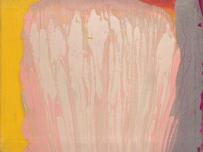
Similarly, three works to the left of the entrance, by Bowling, who was foregoing the traditional use of a brush in favour of a self-designed mechanism to pour paint directly onto canvas, Lenoraseas (1976), At Swim Two Manatee (1978) and Curtain (1974), are almost onomatopoeic in the delivery of paint on to the canvas. In Curtain, a central section of the canvas is rendered in a soft, Cadillac pink. Smears of paint drip down, forking after their initial hit on the canvas. The segment to its left is a hot yellow and to its right is a dark, plumb with flickers of bright purple. In Lenoraseas the streaks of white and lavender, mint green and mustard yellow explode and streak down the centre of the canvas. It is hung so that the drips go upwards so that, like Gilliam’s After Micro W #2, it is in a state of suspended motion.
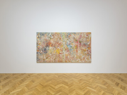
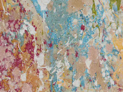
But it is on the back of the central wall where you will find the exhibition’s most compelling work and the strongest of Gilliam’s works on display, Onion Skin (1975). An impressively large piece that, if nothing else, exemplifies his reputation as one of the most underrated artists working now. Like the paint splattered floor of Pollock’s studio, the work is a tantalizing foray into the seductive power of colour. Various shades of mauve are interrupted by delicate explosions of yellows and blues, browns and, at times, green. On top of this, trails of white paint snake throughout. In the centre, a dark strip faintly segments the work into two squares giving the work an air of three-dimensionality. Its magnetic presence is warming, even tender as it quietly continues to always reveal an unseen gesture or form.
