English
 Español
 Français
 Deutsch
 Italiano
 Português
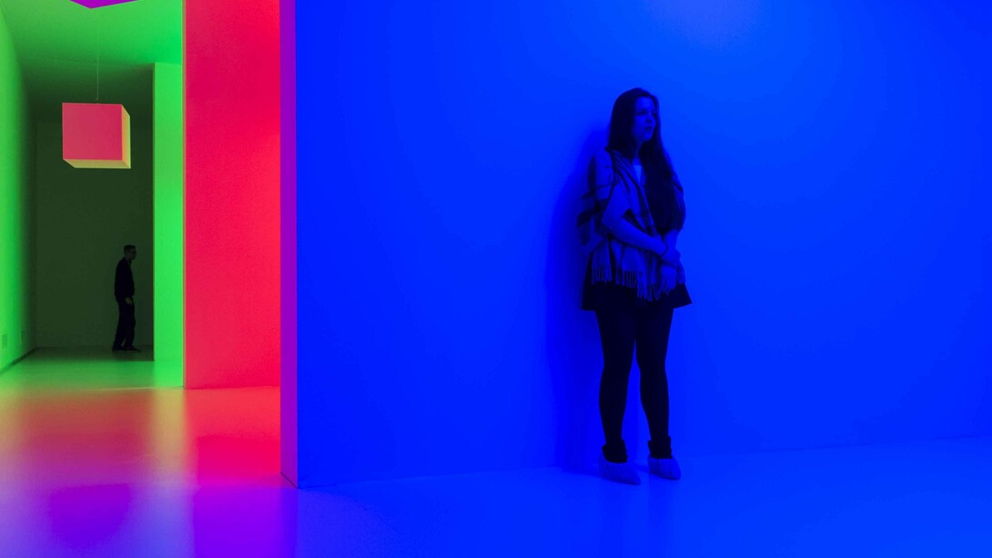
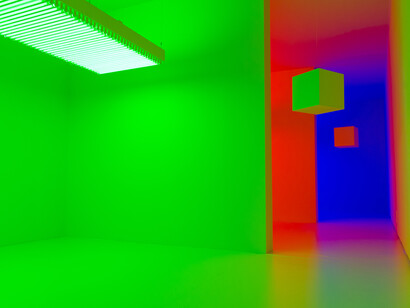
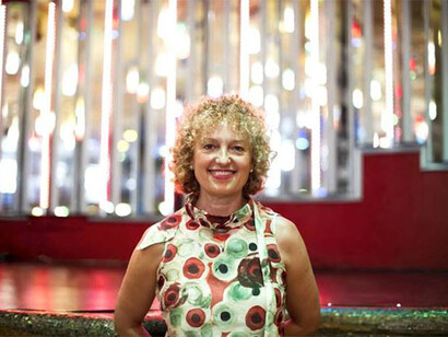
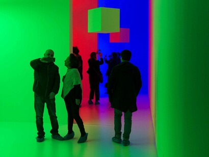
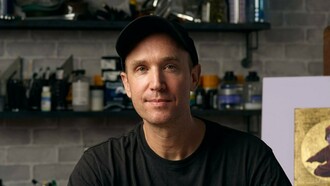
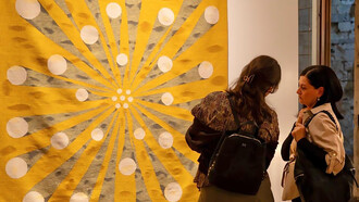
In a rare interview with the author, world-renowned curator Carolyn Christov-Bakargiev offers an insight into the origins and inspiration for her current magnum opus L’emozione dei Colori nell'arte, at GAM – Galleria Civica d’Arte Moderna e Contemporanea, Castello di Rivoli Museo d’Arte Contemporanea, until July 23.
Carolyn, this is a huge project to take on the idea of colour and emotion on this scale. How did it come about?
Well that’s a very good question. It came about on a very small scale, which is that I was looking for quite a number of years, for the original washes (watercolour illustrations) that Annie Besant had asked a bunch of friends including John Varley who was the grandchild of the one who had illustrated Blake, and anyway I had been looking for these original washes for years because I figured that they were published in the thought forms [1] book in 1905 they had to exist as originals and finally two months after the opening of the Istanbul Biennial in September 2015… these were found in Varanasi in the Theosophical Society library [2] and so I started to think “well I should exhibit them immediately!”.
I was thinking at first of just a small Annie Besant show because Annie Besant is a bit of an alter ego, a kind of ideal for me, this revolutionary woman, a feminist and also so poetic, so interested in the world of the invisible and this coloured world that is an inner world. So I had that as an initial impulse and then because we are not exhibiting the original washes because they need to be restored and they are in India… so in fact they aren’t part of the Colori exhibition. But they were the reason that I started the Colori exhibition.
I decided to do a whole show that would explore what is the most elusive of aspects and the most obvious of aspects of art, but with a megalomaniac attitude covering from forever to now. The show then took another twist because it became a book show and historically very diverse and geographically very diverse, because I started thinking of what may have influenced Annie Besant. So that brought me to think about Tantra and Yantra, especially Yantra drawings that were probably a big source so I started looking at some of the exhibitions that had been made, not about colour in art but about the spiritual precursors to modern abstraction and there had been some. There was one in Frankfurt, there was one in LA, so that sort of took me towards focusing even more on colour because I didn’t want to repeat the same show… I mean why would I be giving a show about the spiritual precursors to modern abstraction? First of all it had already been done and secondly we are no longer in the modern age, we are in the digital age, so then I just started to think about how art historians generally speak about iconography and form and composition and why they talk about iconography in preference to colour. We often hear ‘Tintoretto was a great colourist’ and such sentences, but otherwise they actually don’t delve into it and the reason is that they were all using photographs and slides to do their art history.
Art history is bored with photography and since colour is so elusive and it changes so much from one slide to another, from one reproduction to another you couldn’t find this art history truth out, so that made it even more important to me, it’s like the hidden history. So that brought me to thinking about Newton and the dispute with Robert Hooke and later Goethe [3] that really becomes the beginning of the show. Newton’s Opticks [4] and the discovery that white is made from all the colours is really important to this show.
Can I just ask in terms about expansion of this small idea to becoming, you know, 120-odd artists and over 400 works, how on earth did you stop?
Well, I didn’t really stop. Damien Hirst has designed the most gorgeous cover for the catalogue even as we go to print. I never really stop so in a way the cover of the catalogue became an additional art work. It’s just that at a certain point you have to tell the shippers to ship and you have to stop. The other side of the Newton /Goethe diatribe is good… it is ridiculing Newton and saying “but how in the world can you think that colour is objective and scientifically corresponding to a certain electromagnetic wavelength if for I look at something green and then I look at a white well and I see red - so obviously the colour is made in the brain and that opened this whole alliance for the show and its subject between neuroscience today; so we are working with neuroscientists Vittorio Gallese and others and that alliance is a way of going back to the roots the birth date and so when you ask me how do I stop…well, the last object to be shipped which will arrive early next week is the original wooden screen and the original glass prism that Goethe used in his office and nobody was interested in these except for the science museum, so actually visitors will be able to look through the actual original prism that Goethe used when he studied what happened on the edges of black.
So why not Ad Reinhardt then?
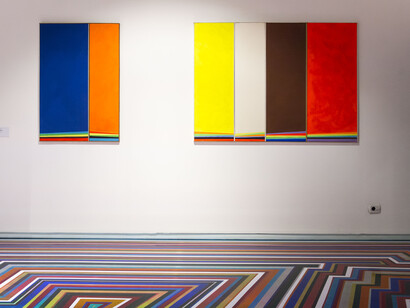
As you said you have to stop somewhere so one reason is that I wanted to also use the opportunity of studying colour in art to recon canonical histories of art, so we don’t have a huge amount of American colour field artists, it’s very much a connoisseur exhibition, so I have the first colour work that Dan Flavin ever made which is a wonderful yellow piece loaned from Dia Foundation. We also have the first colour work that Donald Judd ever made, a beautiful 1963 bed piece that was in his first show - and we do have gorgeous Ellsworth Kelly’s from the Reina Sofia but we don’t have the whole American…you know post-colour field and abstract expressionist thing because I wanted to give space to other things that were happening at the same time in other parts of the world. COBRA are very much in the show and of course Hans Hoffmann is very important as a key source of abstract expressionists’ thinking around colour as a whole. I absolutely wanted people like De Staël to be included; maybe to the person on the street De Staël doesn’t represent such a big name, but he is an extraordinary and very valuable artist for the show, especially being better known in Europe. But to return to your question, one reason for not having a Reinhardt was simply that I wanted to make way for a lot of other things, but that means that there isn’t as much space for the canonical history, to reassure you, black is present absolutely in the show in the form of a beautiful black hole by Anish Kapoor.
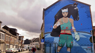
One of the pieces that I was really excited to see was Tony Cragg’s ‘Riot’ because it has got a very particular kind of contemporary resonance at a febrile moment in European history. Do you think that there is a new piquancy to such works in the current international context?
I chose that Tony Cragg work very carefully precisely because of the moment, I don’t think that your comment is out of place and it’s not just the British or UK Brexit issue, it’s also an issue in America, Turkey or Russia. We have a world where individual agency and the sense of political forms of resistance are gaining a new lease of life.
Can I ask you if there is one thing you would like a viewer to take away from the show as a residing memory or feeling, and if so, what would that be?
Oh Gosh! You catch me out! Let me think, on the one hand I think about the subdued colours that we see in the media, often grey and brown and metallic; the dust of Aleppo, the rubble of the Twin Towers etc. and then I think about Matisse; in the middle of World War One and again in the middle of World War 2, and know what moved Matisse to use those vibrant saturated colours was a form of resistance I guess to a bleak imaginary that’s constructed by the media … not as an escape… not as a form of escape but as a form of resistance and joy because the pigments… the CYMK pigments which are mixed together by bombs for example are actually made up from a beautiful colour palette. So if we could just rewind them and to pick out that beautiful blue and that beautiful orange and that beautiful green…so it’s a kind of a time-rewind thing on the level of pigments. I also think the opposite because I am really an Adorno [5] person, the way I think, so I always think one thing and its opposite. Somehow any statement’s false the minute it is said.
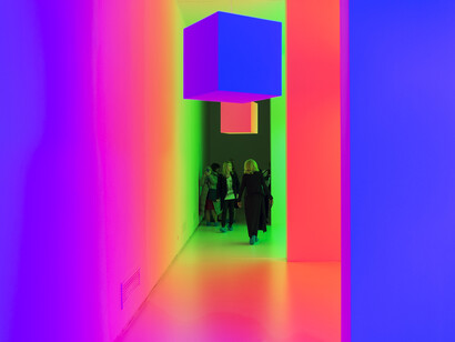
After seeing Ed Atkins work but even older artists like Carlos Cruz-Diez or mid career practitioners like Olafur Eliasson and the way that colour is also very seductive. It is also full of potential poison in the sense that in the digital age, when we live with our screens, our little hand held smart devices, we are constantly living in this shiny, colourful ‘Google’ brand which brings us to forget the grey and the brown of that dust; so the show is both an invitation to the joys of colour and also to be made aware of the dangerous and illusionistic seductiveness of the palette.
Notes:
[1] Besant, A. and Leadbeater, C. (1905). Thought-Forms. By A. Besant and C.W. Leadbeater. With fifty-eight illustrations. 1st ed. London: Theosophical Publishing Society.
[2] ‘The Indian Section of the Theosophical Society’ is a component part of the Theosophical Society which was established in New York, USA in 1875 by Henry Steel Olcott, Helena Petrovna Blavatsky, and William Quan Judge et al. It was incorporated on 3 April 1905 with its base in Madras, India.
[3] Robert Hooke and Isaac Newton were engaged in a bitter exchange over particle theory which prompted Newton to postpone publication of Opticks until after Hooke's death in 1703. Opticks was decried by many natural philosophers who had a strong allegiance to Cartesian philosophy and Aristotelian ideas on colour. Goethe also supported the fundamental nature of white light well into the 19th century, particularly in his work Farbenlehre (colour-reader).
[4] Opticks: Or, a Treatise of the Reflexions, Refractions, Inflexions and Colours of Light was published in 1704 by English scientist and philosopher Isaac Newton.
[5] Theodor W. Adorno (born Theodor L. Wiesengrund; (September 11, 1903 – August 6, 1969) was a German philosopher, sociologist, and composer known for his critique of German National Socialism.