 English
 Español
 Français
 Deutsch
 Italiano
 Português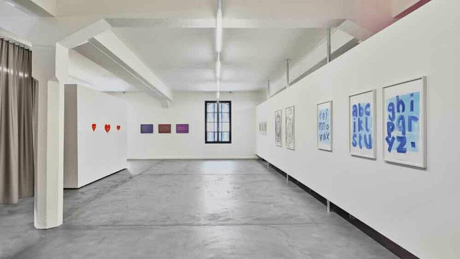
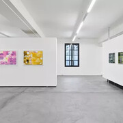
The exhibition Words brings together works by Rosa Barba, Robert Barry, Tony Cokes, Bethan Huws, Daniela Keiser, Renée Levi, Jonathan Monk and Nora Turato in which words themselves become material: as individual terms, sentences, and signs. The focus is less on language as an abstract system than on the word as a visible unit of meaning: an element that can be placed, repeated, shifted, printed, read, and recontextualized. Since Conceptual Art emerged in the 1960s, words and linguistic signs have been central means of expanding art from the visible object into the realm of idea, action, and perception.
For printmaking, this development has been particularly formative. Few other media connect the physical presence of material, color, and support so directly with the possibility of reproducing and disseminating ideas. Especially today, in an age of large language models, in which words have become tools and building blocks of artificial intelligence, the question of their origins, structures, and material forms arises anew. In Words, words return to concrete forms: the alphabet, the individual term, the sentence, the fragment, the trace, and the sign.
With the series Vaduz-isms, Tony Cokes continues his engagement with words as political, affective, and cultural material. The three works are based on light boxes presented as part of his exhibition Tony Cokes – Let yourself be free at Kunstmuseum Liechtenstein (2025–2026). The sentences “There is no yesterday in the life of the night”, “we don’t have the freedom to be bored anymore” and “forgetting all about tomorrow” read at once like aphorisms and ideological formulas. For the edition, they were realized as screen prints with iridescent interference pigments on black paper. The color shifts depending on light and viewing angle. Meaning therefore appears not as fixed, but as dependent on context, perspective, and position.
Daniela Keiser’s new series News from the banana leaves is based on an image from a trip to Tamil Nadu in January 2025. In local canteens, Keiser encountered stacks of fresh banana leaves with sheets of newspaper placed between them. Through the thin leaves, the writing and images of the newspaper show through. The motif connects everyday life, words, and information, while opening questions of translation, legibility, and the limits of understanding. The works were realized as photogravures: the photographic motif was separated into four layers and transferred onto individual plates, from which different combinations and color variations emerged during the printing process. The colors refer to different parts and states of the banana plant. Like words, they too change, shift meanings, and bring forth new forms.
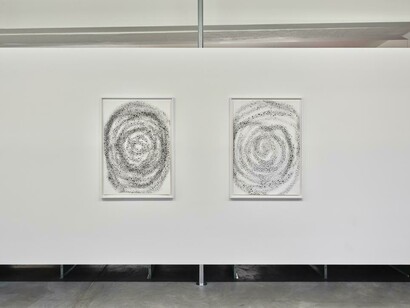
Rosa Barba’s new edition is created with a sphere whose surface is entirely covered with letters, numbers, and signs. The sculpture is at once an object, an archive, and a printing tool. For the edition, it was inked and moved by hand across the paper. Each movement, each rotation, and each pressure leave a different trace, resulting in a series of 20 unique works. The work relates to Barba’s Language infinity sphere, a sculpture made of old letterpress characters that form a dense matrix of numbers, signs, and fragments. Here, words become a material storage of information, time, and movement.
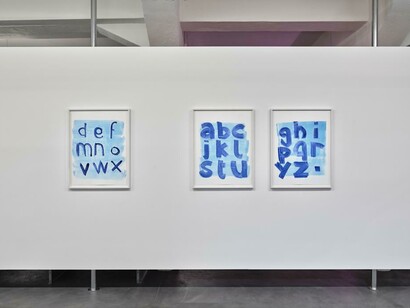
Renée Levi’s Annie consists of 39 monotypes, structured into thirteen three-part sequences. The starting point is the alphabet: the first sheet always begins with “a”, the second with “d”, the third with “g”. From this simple system, three variants emerge. Thin dark-blue letters appear almost sprayed onto a manganese-colored ground; other signs become broad, bodily forms or emerge only through application, trace, and imprint. Levi does not use the alphabet as a neutral system of order, but as material. Letters remain legible while at the same time withdrawing from reading. In the monotype, the sign becomes the imprint of a moment: the sign becomes image, the image remains sign.
Nora Turato’s new works for Edition VFO and Monopol Magazin emerge from the material that has shaped her practice for years: words. The three works are titled i could be, i could live, and i could love. The short formulations seem direct, but their grammatical openness gives them greater tension. “i could” does not describe a fixed state, but a possibility: to be, to live, to love. The works were printed in yellow lettering on red Plexiglas. Heart shape, color, and material take up a seemingly universal visual language of love, emotion, and pop culture, shifting it into a precise, sign-like form. Mounted with spacers, the works detach from the wall and appear as floating signs in space.
Robert Barry’s edition Time… appears in A3 format, in intense shades of blue and with an artist’s frame. The work connects directly to Barry’s current engagement with the word “Time” as both concept and visual element. Since the late 1960s, Barry has investigated forms of presence that elude direct perception, such as radio waves, inert gases, and electromagnetic fields. In Time..., time is not depicted; it is activated as an experience. The three dots open up the term and suggest that something continues beyond the present moment. Between word, form, and color, a mental space emerges in which time appears as duration, memory, and expectation.
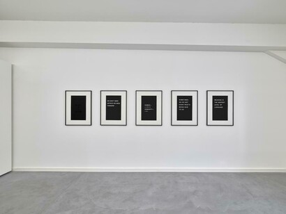
Bethan Huws’ five editions translate her Word vitrines into screen print. Since 1999, Huws has worked with industrial display cases with glass fronts, black backgrounds, and interchangeable white letters, familiar from restaurants, offices, and public spaces. On paper, this formal clarity becomes a reduced pictorial structure: black ground, precise typography, strong contrasts. Sentences such as “Sometimes we do not know what’s being said to us”, “Meaning is the deepest level of language”, or “Black is a colour” do not function as clear messages, but as impulses for thought. The black-on-black printed work in particular returns this reflection to the materiality of print: the sentence is present, but its visibility depends on the act of seeing itself.
Jonathan Monk’s new series begins with the sentence: “This screen print on whiteboard edition should ideally be hung to the right of a ______”. Screen-printed onto a standard whiteboard, it includes a blank that Monk fills in by hand with a blue whiteboard marker. The names are those of renowned artists. The result is a precise work about hanging, value, and the power of the name. The printed sentence repeats, while the handwritten addition makes each whiteboard unique. The fact that the sentence itself speaks of an “edition” is part of the work: Monk places a term from the world of reproduction onto an object that becomes singular again through handwriting. At the same time, the whiteboard points to places where ideas are noted, corrected, and erased again.
The works in Words return the word from digital, conceptual, everyday, and political contexts to material form: printed, rolled, framed, mirrored, overlaid, or filled in by hand. This is precisely where the relevance of Conceptual Art and Word Art for printmaking lies. Print is not only a process for reproducing images, but above all a means of putting words as carriers of ideas, systems, and positions into circulation. In a present shaped by screens, platforms, advertising, news, and AI-generated processes, these works insist on the physical presence of words. They show that a word does not only mean something, but also has form, color, material, context, and history.